Using R: 10 years with R

Yesterday, 29 Feburary 2020, was the 20th anniversary of the release R 1.0.0. Jozef Hajnala’s blog has a cute anniversary post with some trivia. I realised that it is also (not to the day, but to the year) my R anniversary.

I started using R in 2010, during my MSc project in Linköping. Daniel Nätt, who was a PhD student there at the time, was using it for gene expression and DNA methylation work. I think that was the reason he was pulled into R; he needed the Bioconductor packages for microarrays. He introduced me. Thanks, Daniel!

I think I must first have used it to do something with qPCR melting curves. I remember that I wrote some function to reshape/pivot data between long and wide format. It was probably an atrocity of nested loops and hard bracket indexing. Coming right from an undergraduate programme with courses using Ada and C++, even if we had also used Minitab for statistics and Matlab for engineering, I spoke R with a strong accent. At any rate, I was primed to think that doing my data analysis with code was a good idea, and jumped at the opportunity to learn a tool for it. Thanks, undergraduate programme!

I think the easiest thing to love about R is the package system. You can certainly end up in dependency hell with R and metaphorically shoot your own foot, especially on a shared high performance computing system. But I wouldn’t run into any of that until after several years. I was, and still am, impressed by how packages just worked, and could do almost anything. So, the Bioconductor packages were probably, indirectly, why I was introduced to R, and after that, my R story can be told in a series of packages. Thanks, CRAN!

The next package was R/qtl, that I relied on for my PhD. I had my own copy of the R/qtl book. For a period, I probably wrote thing every day:

library(qtl)

cross <- read.cross(file = "F8_geno_trim.csv", format = "csv")

R/qtl is one of my favourite pieces or research software, relatively friendly and with lots of documentation. Thanks, R/qtl developers!

Of course it was Dom Wright, who was my PhD supervisor, who introduced me to R/qtl, and I think it was also he who introduced me to ggplot2. At least he used it, and at some point we were together trying to fix the formatting of a graph, probably with some ugly hack. I decided to use ggplot2 as much as possible, and as it is wont to, ggplot2 made me care about rearranging data, thus leading to reshape2 and plyr. ”The magic is not in plotting the data but in tidying and rearranging the data for plotting.” After a while, most everything I wrote used the ddply function in some way. Thank you, Hadley Wickham!

Then came the contemporary tidyverse. For the longest time, I was uneasy with tidyr, and I’m still not a regular purrr user, but one can’t avoid loving dplyr. How much? My talk at the Swedish Bioinformatics Workshop in 2016 had a slide expressing my love of the filter function. It did not receive the cheers that the function deserves. Maybe the audience were Python users. With new file reading functions, new data frames and functions to manipulate data frames, modern R has become smoother and friendlier. Thanks, tidyverse developers!

The history of R on this blog started in 2011, originally as a way to make notes for myself or, ”a fellow user who’s trying to google his or her way to a solution”. This turned into a series of things to help teach R to biologists around me.

There was the Slightly different introduction to R series of blog posts. It used packages that feel somewhat outdated, and today, I don’t think there’s anything even slightly different about advocating RStudio, and teaching ggplot2 from the beginning.

This spawned a couple of seminars in course for PhD students, which were updated for the Wright lab computation lunches, and eventually turned into a course of its own given in 2017. It would be fun to update it and give it again.

The last few years, I’ve been using R for reasonably large genome datasets in a HPC environment, and gotten back to the beginnings, I guess, by using Bioconducor a lot more. However, the package that I think epitomises the last years of my R use is AlphaSimR, developed by colleagues in Edinburgh. It’s great to be able throw together a quick simulation to check how some feature of genetics behaves. AlphaSimR itself is also an example of how far the R/C++ integration has come with RCpp and RCppArmadillo. Thanks, Chris!

In summary, R is my tool of choice for almost anything. I hope we’ll still be using it, in new and interesting ways, in another ten years. Thank you, R core team!
Using R: From gather to pivot

Since version 1.0.0, released in September, the tidyr package has a new replacement for the gather/spread pair of functions, called pivot_longer/pivot_wider. (See the blog post about the release. It can do a lot of cool things.) Just what we needed, another pair of names for melt/cast, right?

Yes, I feel like this might just be what we need!

My journey started with reshape2, and after a bit of confusion, I internalised the logic of melt/cast. Look at this beauty:

library(reshape2)
fake_data <- data.frame(id = 1:20,
                        variable1 = runif(20, 0, 1),
                        variable2 = rnorm(20))
melted <- melt(fake_data, id.vars = "id")

This turns a data frame that looks like this …

  id  variable1   variable2
1  1 0.10287737 -0.21740708
2  2 0.04219212  1.36050438
3  3 0.78119150  0.09808656
4  4 0.44304613  0.48306900
5  5 0.30720140 -0.45028374
6  6 0.42387957  1.16875579

… into a data frame that looks like this:

  id  variable      value
1  1 variable1 0.10287737
2  2 variable1 0.04219212
3  3 variable1 0.78119150
4  4 variable1 0.44304613
5  5 variable1 0.30720140
6  6 variable1 0.42387957

This is extremely useful. Among other things it comes up all the time when using ggplot2.

Then, as I detailed in a post two years ago, I switched to tidyr as that became the replacement package. ”Gather” and ”spread” made no sense to me as descriptions of operations on a data frame. To be fair, ”melt” and ”cast” felt equally arbitrary, but by that time I was used to them. Getting the logic of the arguments, the order, what needed quotation marks and not, took some staring at examples and a fair bit of trial and error.

Here are some examples. If you’re not used to these functions, just skip ahead, because you will want to learn the pivot functions instead!

library(tidyr)
melted <- gather(fake_data, variable, value, 2:3)
 
## Column names instead of indices
melted <- gather(fake_data, variable, value, variable1, variable2)
 
## Excluding instead of including
melted <- gather(fake_data, variable, value, -1)
 
## Excluding using column name
melted <- gather(fake_data, variable, value, -id)

Enter the pivot functions. Now, I have never used pivot tables in any spreadsheet software, and in fact, the best way to explain them to me was to tell me that they were like melt/cast (and summarise) … But pivot_longer/pivot_wider are friendlier on first use than gather/spread. The naming of both the functions themselves and their arguments feel like a definite improvement.

long <- pivot_longer(fake_data, 2:3,
                     names_to = "variable",
                     values_to = "value")
# A tibble: 40 x 3
      id variable    value
           
 1     1 variable1  0.103 
 2     1 variable2 -0.217 
 3     2 variable1  0.0422
 4     2 variable2  1.36  
 5     3 variable1  0.781 
 6     3 variable2  0.0981
 7     4 variable1  0.443 
 8     4 variable2  0.483 
 9     5 variable1  0.307 
10     5 variable2 -0.450 
# … with 30 more rows

We tell it into what column we want the names to go, and into what column we want the values to go. The function is named after a verb that is associated with moving things about in tables all the way to matrix algebra, followed by an adjective (in my opinion the most descriptive, out of the alternatives) that describes the layout of the data that we want.

Or, to switch us back again:

wide <- pivot_wider(long,
                    names_from = "variable",
                    values_from = "value")
# A tibble: 20 x 3
      id variable1 variable2
             
 1     1    0.103    -0.217 
 2     2    0.0422    1.36  
 3     3    0.781     0.0981
 4     4    0.443     0.483 
 5     5    0.307    -0.450 
 6     6    0.424     1.17  

Here, instead, we tell it where we want the new column names taken from and where we want the new values taken from. None of this is self-explanatory, by any means, but they are thoughtful choices that make a lot of sense.

We’ll see what I think after trying to explain them to beginners a few times, and after I’ve fought warning messages involving list columns for some time, but so far: well done, tidyr developers!

Using R: Correlation heatmap with ggplot2

(This post was originally written on 2013-03-23. Since then, it has persistently remained one of my most visited posts, and I’ve decided to revisit and update it. I may do the same to some other old R-related posts that people still arrive on through search engines. There was also this follow-up, which I’ve now incorporated here.)

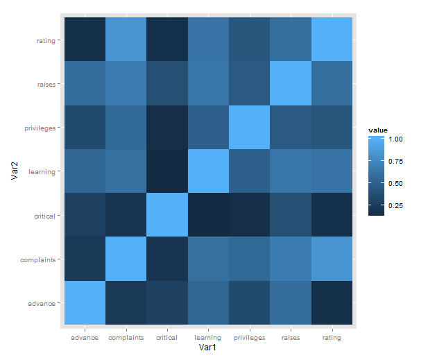
Just a short post to celebrate when I learned how incredibly easy it is to make a heatmap of correlations with ggplot2 (with some appropriate data preparation, of course). Here is a minimal example using the reshape2 package for preparation and the built-in attitude dataset:

library(ggplot2)
library(reshape2)
qplot(x = Var1, y = Var2,
      data = melt(cor(attitude)),
      fill = value,
      geom = "tile")

attitude_heatmap

What is going on in that short passage?

  • cor makes a correlation matrix with all the pairwise correlations between variables (twice; plus a diagonal of ones).
  • melt takes the matrix and creates a data frame in long form, each row consisting of id variables Var1 and Var2 and a single value.
  • We then plot with the tile geometry, mapping the indicator variables to rows and columns, and value (i.e. correlations) to the fill colour.

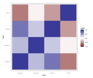
However, there is one more thing that is really need, even if just for the first quick plot one makes for oneself: a better scale. The default scale is not the best for correlations, which range from -1 to 1, because it’s hard to tell where zero is. Let’s use the airquality dataset for illustration as it actually has some negative correlations. In ggplot2, a scale that has a midpoint and a different colour in each direction is called scale_colour_gradient2, and we just need to add it. I also set the limits to -1 and 1, which doesn’t change the colour but fills out the legend for completeness. Done!

data <- airquality[,1:4]
qplot(x = Var1, y = Var2,
      data = melt(cor(data, use = "p")),
      fill = value,
      geom = "tile") +
   scale_fill_gradient2(limits = c(-1, 1))

correlation_heatmap2

Finally, if you’re anything like me, you may be phasing out reshape2 in favour of tidyr. If so, you’ll need another function call to turn the matrix into a data frame, like so:

library(tidyr)

correlations <- data.frame(cor(data, use = "p"))
correlations$Var1 <- rownames(correlations)
melted <- gather(correlations, "value", "Var2", -Var1)

qplot(x = Var1, y = Var2,
      data = melted,
      fill = value,
      geom = "tile") +
   scale_fill_gradient2(limits = c(-1, 1))

The data preparation is no longer a oneliner, but, honestly, it probably shouldn’t be.

Okay, you won’t stop reading until we’ve made a solution with pipes? Sure, we can do that! It will be pretty gratuitous and messy, though. From the top!

library(magrittr)

airquality %>%
    '['(1:4) %>%
    data.frame %>%
    transform(Var1 = rownames(.)) %>%
    gather("Var2", "value", -Var1) %>%
    ggplot() +
        geom_tile(aes(x = Var1,
                      y = Var2,
                      fill = value)) +
        scale_fill_gradient2(limits = c(-1, 1))

What single step does with relationship

We had a journal club about the single step GBLUP method for genomic evaluation a few weeks ago. In this post, we’ll make a few graphs of how the single step method models relatedness between individuals.

Imagine you want to use genomic selection in a breeding program that already has a bunch of historical pedigree and trait information. You could use some so-called multistep evaluation that uses one model for the classical pedigree + trait quantitative genetics and one model for the genotype + trait genomic evaluation, and then mix the predictions from them together. Or you could use the single-step method, which combines pedigree, genotypes and traits into one model. It does this by combining the relationship estimates from pedigree and genotypes. That matrix can then go into your mixed model.

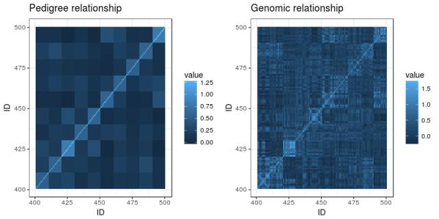
We’ll illustrate this with a tiny simulated population: five generations of 100 individuals per generation, where ten random pairings produce the next generation, with families of ten individuals. (The R code is on Github and uses AlphaSimR for simulation and AGHmatrix for matrices). Here is a heatmap of the pedigree-based additive relationship matrix for the population:

What do we see? In the lower left corner are the founders, and not knowing anything about their heritage, the matrix has them down as unrelated. The squares of high relatedness along the diagonal are the families in each generation. As we go upwards and to the right, relationship is building up.

Now, imagine the last generation of the population also has been genotyped with a SNP chip. Here is a heatmap of their genomic relationship matrix:

Genomic relationship is more detailed. We can still discern the ten families within the last generation, but no longer are all the siblings equally related to each other and to their ancestors. The genotyping helps track segregation within families, pointing out to us when relatives are more or less related than the average that we get from the pedigree.

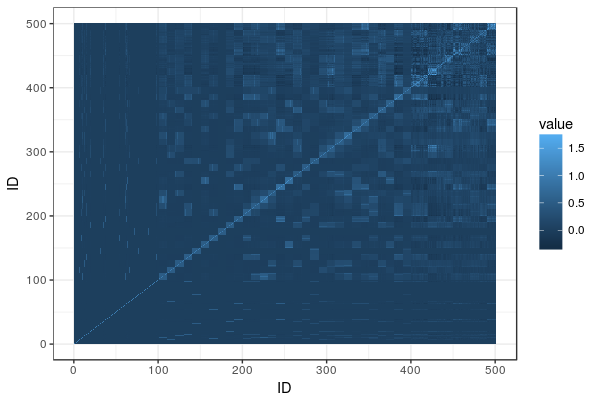
Enter the single-step relationship matrix. The idea is to put in the genomic relationships for the genotyped individuals into the big pedigree-based relationship matrix, and then adjust the rest of the matrix to propagate that extra information we now have from the genotyped individuals to their ungenotyped relatives. Here is the resulting heatmap:

You can find the matrix equations in Legarra, Aguilar & Misztal (2009). The matrix, called H, is broken down into four partitions called H11, H12, H21, and H22. H22 is the part that pertains to the genotyped animals, and it’s equal to the genomic relationship matrix G (after some rescaling). The others are transformations of G and the corresponding parts of the additive relationship matrix, spreading G onto A.

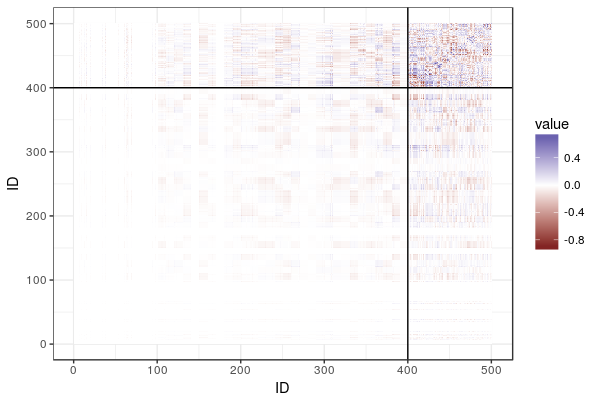
To show what is going on, here is the difference between the additive relationship matrix and the single-step relationship matrix, with lines delineating the genotyped animals and breaking the matrix into the four partitions:

What do we see? In the top right corner, we have a lot of difference, where the genomic relationship matrix has been plugged in. Then, fading as we go from top to bottom and from right to left, we see the influence of the genomic relationship on relatives, diminishing the further we get from the genotyped individuals.

Literature

Legarra, Andres, I. Aguilar, and I. Misztal. ”A relationship matrix including full pedigree and genomic information.” Journal of dairy science 92.9 (2009): 4656-4663.

Using R: reshape2 to tidyr

Tidy data — it’s one of those terms that tend to confuse people, and certainly confused me. It’s Codd’s third normal form, but you can’t go around telling that to people and expect to be understood. One form is ”long”, the other is ”wide”. One form is ”melted”, another ”cast”. One form is ”gathered”, the other ”spread”. To make matters worse, I often botch the explanation and mix up at least two of the terms.

The word is also associated with the tidyverse suite of R packages in a somewhat loose way. But you don’t need to write in a tidyverse-style (including the %>%s and all) to enjoy tidy data.

But Hadley Wickham’s definition is straightforward:

In tidy data:
1. Each variable forms a column.
2. Each observation forms a row.
3. Each type of observational unit forms a table.

In practice, I don’t think people always take their data frames all the way to tidy. For example, to make a scatterplot, it is convenient to keep a couple of variables as different columns. The key is that we need to move between different forms rapidly (brain time-rapidly, more than computer time-rapidly, I might add).

And not everything should be organized this way. If you’re a geneticist, genotypes are notoriously inconvenient in normalized form. Better keep that individual by marker matrix.

The first serious piece of R code I wrote for someone else was a function to turn data into long form for plotting. I suspect plotting is often the gateway to tidy data. The function was like what you’d expect from R code written by a beginner who comes from C-style languages: It reinvented the wheel, and I bet it had nested for loops, a bunch of hard bracket indices, and so on. Then I discovered reshape2.

library(reshape2)
fake_data <- data.frame(id = 1:20,
                        variable1 = runif(20, 0, 1),
                        variable2 = rnorm(20))
melted <- melt(fake_data, id.vars = "id")

The id.vars argument is to tell the function that the id column is the key, a column that tells us which individual each observation comes from. As the name suggests, id.vars can name multiple columns in a vector.

So the is the data before:

  id   variable1    variable2
1  1 0.938173781  0.852098580
2  2 0.408216233  0.261269134
3  3 0.341325188  1.796235963
4  4 0.958889279 -0.356218000

And this is after. We go from 20 rows to 40: two variables times 20 individuals.

  id  variable       value
1  1 variable1 0.938173781
2  2 variable1 0.408216233
3  3 variable1 0.341325188
4  4 variable1 0.958889279

And now: tidyr. tidyr is the new tidyverse package for rearranging data like this.

The tidyr equivalent of the melt function is called gather. There are two important differences that messed with my mind at first.

The melt and gather functions take the opposite default assumption about what columns should be treated as keys and what columns should be treated as containing values. In melt, as we saw above, we need to list the keys to keep them with each observation. In gather, we need to list the value columns, and the rest will be treated as keys.

Also, the second and third arguments (and they would be the first and second if you piped something into it), are the variable names that will be used in the long form data. In this case, to get a data frame that looks exactly the same as the first, we will stick with ”variable” and ”value”.

Here are five different ways to get the same long form data frame as above:

library(tidyr)
melted <- gather(fake_data, variable, value, 2:3)

## Column names instead of indices
melted <- gather(fake_data, variable, value, variable1, variable2)

## Excluding instead of including
melted <- gather(fake_data, variable, value, -1)

## Excluding using column name
melted <- gather(fake_data, variable, value, -id)

## With pipe
melted <- fake_data %>% gather(variable, value, -id)

Usually, this is the transformation we need: wide to long. If we need to go the other way, we can use plyr’s cast functions, and tidyr’s gather. This code recovers the original data frame:

## plyr
dcast(melted, id ~  variable)

## tidyr
spread(melted, variable, value)

Using R: quickly calculating summary statistics from a data frame

A colleague asked: I have a lot of data in a table and I’d like to pull out some summary statistics for different subgroups. Can R do this for me quickly?

Yes, there are several pretty convenient ways. I wrote about this in the recent post on the barplot, but as this is an important part of quickly getting something useful out of R, just like importing data, I’ll break it out into a post of its own. I will present a solution that uses the plyr and reshape2 packages. You can do the same with base R, and there’s nothing wrong with base R, but I find that plyr and reshape2 makes things convenient and easy to remember. The apply family of functions in base R does the same job as plyr, but with a slightly different interface. I strongly recommend beginners to begin with plyr or the apply functions, and not what I did initially, which was nested for loops and hard bracket indexing.

We’ll go through and see what the different parts do. First, simulate some data. Again, when you do this, you usually have a table already, and you can ignore the simulation code. Usually a well formed data frame will look something this: a table where each observation is a unit such as an individual, and each column gives the data about the individual. Here, we imagine two binary predictors (sex and treatment) and two continuous response variables.

data <- data.frame(sex = c(rep(1, 1000), rep(2, 1000)),
                   treatment = rep(c(1, 2), 1000),
                   response1 = rnorm(2000, 0, 1),
                   response2 = rnorm(2000, 0, 1))
head(data)
  sex treatment   response1   response2
1   1         1 -0.15668214 -0.13663012
2   1         2 -0.40934759 -0.07220426
3   1         1  0.07103731 -2.60549018
4   1         2  0.15113270  1.81803178
5   1         1  0.30836910  0.32596016
6   1         2 -1.41891407  1.12561812

Now, calculating a function of the response in some group is straightforward. Most R functions are vectorised by default and will accept a vector (that is, a column of a data frame). The subset function lets us pull out rows from the data frame based on a logical expression using the column names. Say that we want mean, standard deviation and a simple standard error of the mean. I will assume that we have no missing values. If you have, you can add na.rm=T to the function calls. And again, if you’ve got a more sophisticated model, these might not be the standard errors you want. Then pull them from the fitted model instead.

mean(subset(data, sex == 1 & treatment == 1)$response1)

sd(subset(data, sex == 1 & treatment == 1)$response1)

sd(subset(data, sex == 1 & treatment == 1)$response1)/
  sqrt(nrow(subset(data, sex == 1 & treatment == 1)))

Okay, but doing this for each combination of the predictors and responses is no fun and requires a lot of copying and pasting. Also, the above function calls are pretty messy with lots of repetition. There is a better way, and that’s where plyr and reshape2 come in. We load the packages. The first time you’ll have to run install.packages, as usual.

library(plyr)
library(reshape2)

First out, the melt function from rehape2. Look at the table above. It’s reasonable in many situations, but right now, it would be better if we put both the response variables in the same column. If it doesn’t seem so useful, trust me and see below. Melt will take all the columns except the ones we single out as id variables and put them in the same column. It makes sense to label each row with the sex and treatment of the individual. If we had an actual unit id column, it would go here as well:

melted <- melt(data, id.vars=c("sex", "treatment"))

The resulting ”melted” table looks like this. Instead of the response variables separately we get a column of values and a column indicating which variable the value comes from.

  sex treatment  variable       value
1   1         1 response1 -0.15668214
2   1         2 response1 -0.40934759
3   1         1 response1  0.07103731
4   1         2 response1  0.15113270
5   1         1 response1  0.30836910
6   1         2 response1 -1.41891407

Now it’s time to calculate the summary statistics again. We will use the same functions as above to do the actual calculations, but we’ll use plyr to automatically apply them to all the subsets we’re interested in. This is sometimes called the split-apply-combine approach: plyr will split the data frame into subsets, apply the function of our choice, and then collect the results for us. The first thing to notice is the function name. All the main plyr functions are called something with -ply. The letters stand for the input and return data type: ddply works on a data frame and returns a data frame. It’s probably the most important member of the family.

The arguments to ddply are the data frame to work on (melted), a vector of the column names to split on, and a function. The arguments after the function name are passed on to the function. Here we want to split in subsets for each sex, treatment and response variable. The function we apply is summarise, which makes a new data frame with named columns based on formulas, allowing us to use the column names of the input data frame in formulas. In effect it does exactly what the name says, summarises a data frame. And in this instance, we want to calculate the mean, standard deviation and standard error of the mean, so we use the above function calls, using value as the input. Run the ddply call, and we’re done!

ddply(melted, c("sex", "treatment", "variable"), summarise,
      mean = mean(value), sd = sd(value),
      sem = sd(value)/sqrt(length(value)))
  sex treatment  variable         mean        sd        sem
1   1         1 response1  0.021856280 1.0124371 0.04527757
2   1         1 response2  0.045928150 1.0151670 0.04539965
3   1         2 response1 -0.065017971 0.9825428 0.04394065
4   1         2 response2  0.011512867 0.9463053 0.04232006
5   2         1 response1 -0.005374208 1.0095468 0.04514830
6   2         1 response2 -0.051699624 1.0154782 0.04541357
7   2         2 response1  0.046622111 0.9848043 0.04404179
8   2         2 response2 -0.055257295 1.0134786 0.04532414

Using R: correlation heatmap, take 2

Apparently, this turned out to be my most popular post ever.  Of course there are lots of things to say about the heatmap (or quilt, tile, guilt plot etc), but what I wrote was literally just a quick celebratory post to commemorate that I’d finally grasped how to combine reshape2 and ggplot2 to quickly make this colourful picture of a correlation matrix.

However, I realised there is one more thing that is really needed, even if just for the first quick plot one makes for oneself: a better scale. The default scale is not the best for correlations, which range from -1 to 1, because it’s hard to tell where zero is. We use the airquality dataset for illustration as it actually has some negative correlations. In ggplot2, it’s very easy to get a scale that has a midpoint and a different colour in each direction. It’s called scale_colour_gradient2, and we just need to add it. I also set the limits to -1 and 1, which doesn’t change the colour but fills out the legend for completeness. Done!

data <- airquality[,1:4]
library(ggplot2)
library(reshape2)
qplot(x=Var1, y=Var2, data=melt(cor(data, use="p")), fill=value, geom="tile") +
   scale_fill_gradient2(limits=c(-1, 1))

correlation_heatmap2