A slightly different introduction to R, part V: plotting and simulating linear models

In the last episode (which was quite some time ago) we looked into comparisons of means with linear models. This time, let’s visualise some linear models with ggplot2, and practice another useful R skill, namely how to simulate data from known models. While doing this, we’ll learn some more about the layered structure of a ggplot2 plot, and some useful thing about the lm function.

11. Using points, lines and error bars to show predictions from linear models

Return to the model of comb gnome mass at time zero. We’ve already plotted the coefficient estimates, but let us just look at them with the coef() function. Here the intercept term is the mean for green comb gnomes subjected to the control treatment. The ‘grouppink’ and ‘treatmentpixies’ coefficients are the mean differences of pink comb gnomes and comb gnomes exposed to pixies from this baseline condition. This way of assigning coefficients is called dummy coding and is the default in R.

model <- lm(mass0 ~ group + treatment, data)
coef(model)[1]
    (Intercept)       grouppink treatmentpixies 
      141.56771       -49.75414        23.52428

The estimate for a pink comb gnome with pixies is:

coef(model)[1] + coef(model)[2] + coef(model)[3]

There are alternative codings (”contrasts”) that you can use. A common one in Anova is to use the intercept as the grand mean and the coefficients as deviations from the mean. (So that the coefficients for different levels of the same factor sum to zero.) We can get this setting in R by changing the contrasts option, and then rerun the model. However, whether the coefficients are easily interpretable or not, they still lead to the same means, and we can always calculate the values of the combinations of levels that interest us.

Instead of typing in the formulas ourself as above, we can get predictions from the model with the predict( ) function. We need a data frame of the new values to predict, which in this case means one row for each combination of the levels of group and treatment. Since we have too levels each there are only for of them, but in general we can use the expand.grid( ) function to generate all possible factor levels. We’ll then get the predictions and their confidence intervals, and bundle everything together to one handy data frame.

levels <- expand.grid(group=c("green", "pink"), treatment=c("control", "pixies"))
predictions <- predict(model, levels, interval="confidence")
predicted.data <- cbind(levels, predictions)
  group treatment       fit       lwr      upr
1 green   control 141.56771 125.82527 157.3101
2  pink   control  91.81357  76.48329 107.1439
3 green    pixies 165.09199 149.34955 180.8344
4  pink    pixies 115.33785  98.93425 131.7414

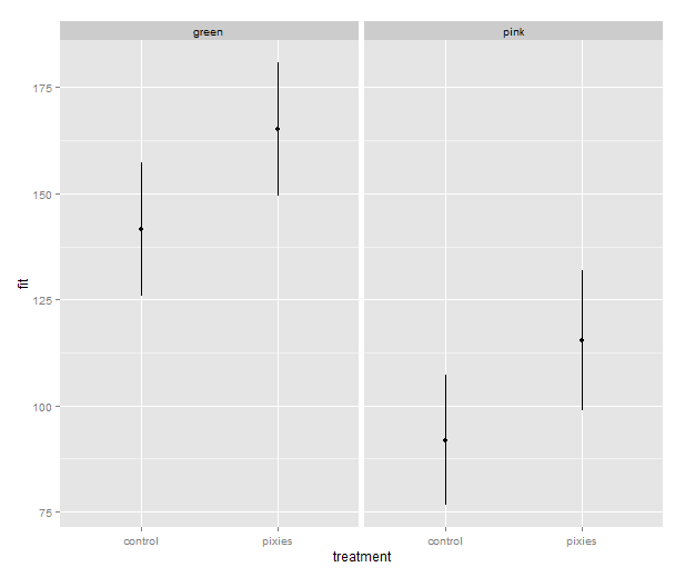
Now that we have these intervals in a data frame we can plot them just like we would any other values. Back in part II, we put several categorical variables into the same plot by colouring the points. Now, let’s introduce nice feature of ggplot2: making small multiples with faceting. qplot( ) takes facets argument which is a formula where the left hand side, before the tilde (‘~’), will be used to split the plot vertically, and the right hand side will split the plot horizontally. In this case, we split horizontally, each panel representing one level of the treatment variable. Also, we use a new geometry: pointrange, which draws a point with bars above and below it and is quite suitable for the intervals we’ve got.

qplot(x=treatment, facets=~group,
      y=fit, ymax=upr, ymin=lwr
      geom="pointrange", data=predicted.data)

model_lineranges

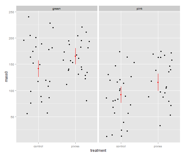
That’s good, but combining the predictions from the model and the actual data in the same plot would be nice. In ggplot2, every plot is an object that can be saved away to a variable. Then we can use the addition operator to add layers to the plot. Let’s make a jittered dotplot like the above and then add a layer with the pointrange geometry displaying confidence intervals. The scatter of the data points around the confidence intervals reminds us that there is quite a bit of residual variance. The coefficient of determination, as seen in the summary earlier, was about 0.25.

qplot(x=treatment, y=mass0, facets=~group, geom="jitter", data=data) +
    geom_pointrange(aes(y=fit, ymax=upr, ymin=lwr), colour="red", data=predicted.data)

model_jitter

In the above, we make use of ggplot2’s more advanced syntax for specifying plots. The addition operator adds layers. The first layer can be set up with qplot(), but the following layers are made with their respective functions. Mapping from variables to features of the plot, called aesthetics, have to be put inside the aes() function. This might look a bit weird in the beginning, but it has its internal logic — all this is described in Hadley Wickham’s ggplot2 book.

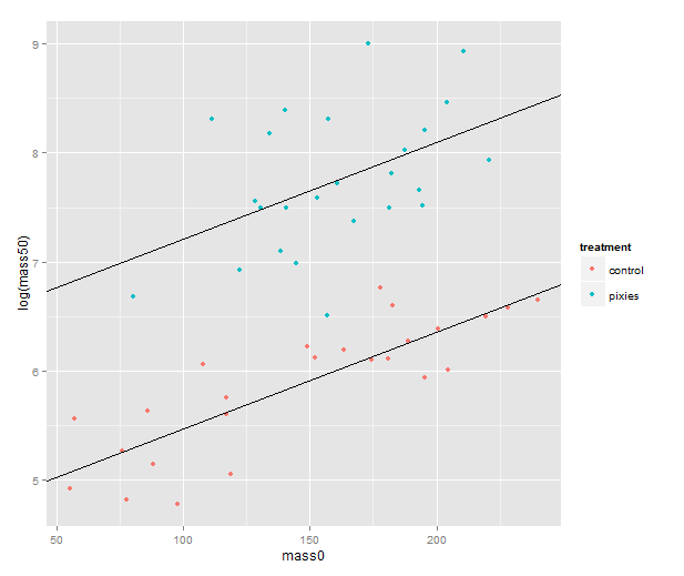
We should probably try a regression line as well. The abline geometry allows us to plot a line with given intercept and slope, i.e. the coefficients of a simple regression. Let us simplify a little and look at the mass at time zero and the log-transformed mass at time 50 in only the green group. We make a linear model that uses the same slope for both treatments and a treatment-specific intercept. (Exercise for the reader: look at the coefficients with coef( ) and verify that I’ve pulled out the intercepts and slope correctly.) Finally, we plot the points with qplot and add the lines one layer at the time.

green.data <- subset(data, group=="green")
model.green <- lm(log(mass50) ~ mass0 + treatment, green.data)
intercept.control <- coef(model.green)[1]
intercept.pixies <- coef(model.green)[1]+coef(model.green)[3]
qplot(x=mass0, y=log(mass50), colour=treatment, data=green.data) +
   geom_abline(intercept=intercept.pixies, slope=coef(model.green)[2]) +
   geom_abline(intercept=intercept.control, slope=coef(model.green)[2])

regression_lines

12. Using pseudorandom numbers for sanity checking

There is a short step from playing with regression functions that we’ve fitted, like we did above, to making up hypothetical regression functions and simulating data from them. This type of fake-data simulation is very useful to for testing how designs and estimation procedures behave and check things like the control of false positive rate and the power to accurately estimate a known model.

The model will be the simplest possible: a single categorical predictor with only two levels and normally distributed equal error variance, i.e. a t-test. There is a formula for the power of the t-test and an R function, power.t.test( ), that calculates it for us without the need for simulation. However, a nice thing about R is that we can pretty easily replace the t-test with more complex procedures. Any model fitting process that you can program in R can be bundled into a function and applied to pseudorandom simulated data. In the next episode we will go into how to make functions and apply them repeatedly.

Let us start out with a no effect model: 50 observations in two groups drawn from the same distribution. We use the mean and variance of the green control group. This first part just sets up the variables:

mu <- mean(subset(data, group=="green" & treatment=="control")$mass0)
sigma <- sd(subset(data, group=="green" & treatment=="control")$mass0)
treatment <- c(rep(1, 50), rep(0, 50))

The rnorm( ) function generates numbers from a normal distribution with specified mean and standard deviation. Apart from drawing numbers from it, R can of course pull out various table values, and it knows other distributions as well. Look at the documentation in ?distributions. Finally we perform a t-test. Most of the time, it should not show a significant effect, but sometimes it will.

sim.null <- rnorm(100, mu, sigma)
t.test(sim.null ~ treatment)$p.value

We can use the replicate( ) function to evaluate an expression multiple times. We put the simulation and t-test together into one expression, rinse and repeat. Finally, we check how many of the 1000 replicates gave a p-value below 0.05. Of course, it will be approximately 5% of them.

sim.p <- replicate(1000, t.test(rnorm(100, mu, sigma) ~ treatment)$p.value)
length(which(sim.p < 0.05))/1000
[1] 0.047

Let us add an effect! Say we’re interested in an effect that we expect to be approximately half the difference between the green and pink comb gnomes:

d <- mean(subset(data, group=="green" & treatment=="control")$mass0) -
     mean(subset(data, group=="pink" & treatment=="control")$mass0)
sim.p.effect <- replicate(1000, t.test(treatment * d/2 +
                                       rnorm(100, mu, sigma) ~ treatment)$p.value)
length(which(sim.p.effect < 0.05))/1000
[1] 0.737

We see that with 50 individuals in each group and this effect size we will detect a significant difference about 75% of the time. This is the power of the test. If you are able to find nice and trustworthy prior information about the kind of effect sizes and variances you expect to find in a study, design analysis allows you to calculate for instance how big a sample you need to have good power. Simulation can also give you an idea of how badly a statistical procedure will break if the assumptions don’t hold. We can try to simulate a situation where the variances of the two groups differs quite a bit.

sim.unequal <- replicate(1000, t.test(c(rnorm(50, mu, sigma),
                                        rnorm(50, mu, 2*sigma)) ~ treatment)$p.value)
length(which(sim.unequal < 0.05))/1000
[1] 0.043
sim.unequal.effect <- replicate(1000, t.test(c(rnorm(50, mu+d/2, sigma),
                                               rnorm(50, mu, 2*sigma)) ~ treatment)$p.value)
length(which(sim.unequal.effect < 0.05))/1000
[1] 0.373

In conclusion, the significance is still under control, but the power has dropped to about 40%. I hope that has given a small taste of how simulation can help with figuring out what is going on in our favourite statistical procedures. Have fun!
A slightly different introduction to R, part IV

Now, after reading in data, making plots and organising commands with scripts and Sweave, we’re ready to do some numerical data analysis. If you’re following this introduction, you’ve probably been waiting for this moment, but I really think it’s a good idea to start with graphics and scripting before statistical calculations.

We’ll use the silly comb gnome dataset again. If you saved an Rdata file in part II, you can load it with

load("comb_gnome_data.Rdata")

If not, you can run this. Remind yourself what the changes to the melted data mean:

data <- read.csv("comb_gnome_data.csv")
library(reshape2)
melted <- melt(data, id.vars=c("id", "group", "treatment"))
melted$time <- 0
melted$time[which(melted$variable=="mass10"] <- 10
melted$time[which(melted$variable=="mass25")] <- 25
melted$time[which(melted$variable=="mass50")] <- 50
melted$id <- factor(melted$id)

We’ve already looked at some plots and figured out that there looks to be substantial differences in mass between the green and pink groups, and the control versus treatment. Let’s try to substantiate that with some statistics.

9. Mean and covariance

Just like anything in R, statistical tools are functions. Some of them come in special packages, but base R can do a lot of stuff out of the box.

Comparsion of two means: We’ve already gotten means from the mean() function and from summary(). Variance and standard deviation are calculated with var() and sd() respectively. Comparing the means betweeen two groups with a t-test or a Wilcoxon-Mann-Whitney test is done with t.test() and wilcox.test(). The functions have the word test in their names, but t-test gives not only the test statistics and p-values, but also estimates and confidence intervals. The parameters are two vectors of values of each group (i.e. a column from the subset of a data frame), and some options.

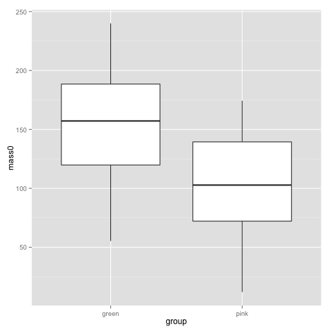
Looking back at this plot, I guess no-one is surprised by a difference in birthweigh between pink and green comb gnomes:

plot2

t.test(subset(data, group=="pink")$mass0, subset(data, group=="green")$mass0)
	Welch Two Sample t-test

data:  subset(data, group == "pink")$mass0 and subset(data, group == "green")$mass0 
t = -5.397, df = 96.821, p-value = 4.814e-07
alternative hypothesis: true difference in means is not equal to 0 
95 percent confidence interval:
 -69.69294 -32.21577 
sample estimates:
mean of x mean of y 
 102.3755  153.3298

That is, we feed in two pieces of data (two vectors, really, which is what you get pulling out a column from a data frame). The above is the typical situation when you have all data points in one column and a group indicator in another. Hence you begin by subsetting the data frame to get the right rows, and pull out the right columns with the $. t.test also does paired tests, with the additional parameter paired=T.

wilcox.test(subset(data, group=="pink")$mass50, subset(data, group=="green")$mass50)
	Wilcoxon rank sum test with continuity correction

data:  subset(data, group == "pink")$mass50 and subset(data, group == "green")$mass50 
W = 605, p-value = 1.454e-05
alternative hypothesis: true location shift is not equal to 0

Recalling histograms for the comb gnome weights, the use of the Wilcoxon-Mann-Whitney for masses at tim 50 and a t-test for the masses at birth (t=0) probably makes sense. However, we probably want to make use of all the time points together rather than doing a test for each time point, and we also want to deal with both the colour and the treatment at the same time.

Before we get there, let’s look at correlation:

cor(data$mass10, data$mass25)
cor(data$mass0, data$mass50, method="spearman")
cor.test(data$mass10, data$mass25)

The cor() function gives you correlation coefficients, both Pearson, Spearman and Kendall. If you want the covariance, cov() is the function for that. cor.test() does associated tests and confidence intervals. One thing to keep in mind is missing values. This data set is complete, but try this:

some.missing <- data$mass0
some.missing[c(10, 20, 30, 40:50)] <- NA
cor(some.missing, data$mass25)
cor(some.missing, data$mass10, use="pairwise")

The use parameter decides what values R should include. The default is all, but we can choose pairwise complete observations instead.

If you have a big table of variables that you’d like to correlate with each other, the cor() function works for them as well. (Not cor.test(), though. However, the function can be applied across the rows of a data frame. We’ll return to that.)

10. A couple of simple linear models

Honestly, most of the statistics in biology is simply linear models fit with least squares and tested with a normal error model. A linear model looks like this

yi = b0 + b1x1i + b2x2i + … bnxni + ei

where y is the response variable, the xs are predictors, i is an index over the data points, and ei are the errors. The error is the only part of the equations that is a random variable. b0, …, bn are the coefficients — your main result, showing how the mean difference in the response variable between data points with different values of the predictors. The coefficients are fit by least squares, and by estimating the variance of the error term, we can get some idea of the uncertainty in the coefficients.

Regression coefficients can be interpreted as predictions about future values or sometimes even as causal claims (depending on other assumptions), but basically, they describe differences in mean values.

This is not a text on linear regression — there are many of those; may I suggest the books by Faraway or Gelman and Hill — suffice to say that as long as the errors are independent and have equal variance, least squares is the best unbiased estimate. If we also assume that the errors are normally distributed, the least squares is also the maximum likelihood estimate. (And it’s essentially the same as a Bayesian version of the linear model with vague priors, just for the record.)

In R, the lm() function handles linear models. The model is entered as a formula of the type response ~ predictor + predictor * interacting predictors. The error is implicit, and assumed to be normally distributed.

model <- lm(mass0 ~ group + treatment, data=data)
summary(model)
Call:
lm(formula = mass0 ~ group + treatment, data = data)

Residuals:
    Min      1Q  Median      3Q     Max 
-86.220 -32.366  -2.847  35.445  98.417 

Coefficients:
                Estimate Std. Error t value Pr(>|t|)    
(Intercept)      141.568      7.931  17.850  < 2e-16 ***
grouppink        -49.754      9.193  -5.412 4.57e-07 ***
treatmentpixies   23.524      9.204   2.556   0.0122 *  
---
Signif. codes:  0 ‘***’ 0.001 ‘**’ 0.01 ‘*’ 0.05 ‘.’ 0.1 ‘ ’ 1 

Residual standard error: 45.67 on 96 degrees of freedom
Multiple R-squared:  0.28,    Adjusted R-squared: 0.265 
F-statistic: 18.67 on 2 and 96 DF,  p-value: 1.418e-07

The summary gives the coefficients, their standard errors, the p-value of a t-test of the regression coefficient, and R squared for the model. Factors are encoded as dummy variables, and R has picked the green group and the control treatment as baseline so the coefficient ”grouppink” describes how the mean of the pink group differs from the green. Here are the corresponding confidence intervals:

confint(model)
                     2.5 %    97.5 %
(Intercept)     125.825271 157.31015
grouppink       -68.001759 -31.50652
treatmentpixies   5.254271  41.79428

(These confidence intervals are not adjusted to control the family-wise error rate, though.) With only two factors, the above table is not that hard to read, but let’s show a graphical summary. Jared Lander’s coefplot gives us a summary of the coefficients:

install.packages("coefplot") ##only the first time
library(coefplot)
coefplot(model)

statplot3

The bars are 2 standard deviations. This kind of plot gives us a quick look at the coefficients, and whether they are far from zero (and therefore statistically significant). It is probably more useful for models with many coefficients.

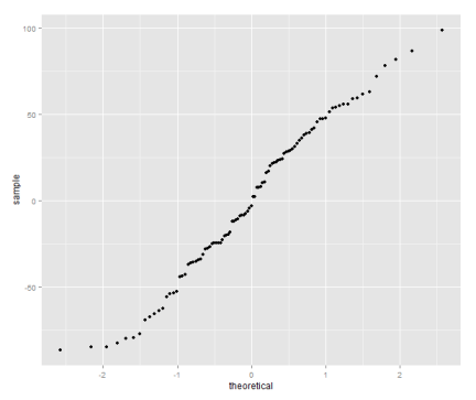
There is a bunch of diagnostic plots that you can make to check for gross violations of the above assumptions of the linear model. Two useful ones are the normal quantile-quantile plot of residuals, and the residuals versus fitted scatterplot:

library(ggplot2)
qplot(sample=residuals(model), stat="qq")

statplot1

The quantile plot compares the distribution of the residual to the quantiles of a normal distribution — if the residuals are normally distributed it will be a straight line.

qplot(fitted(model), residuals(model))

statplot2

Variance should be roughly equal fitted values, and there should not be obvious patterns in the data.

If these plots look terrible, a common approach is to try to find a transformation of the data that allows the linear model to be used anyway. For instance, it often helps to take the logarithm of the response variable. Why is that so useful? Well, with some algebraic magic:

log(yi) = b0 + b1x1i + b2x2i + … + bnxni + ei, and as long as no y:s are zero,

yi = exp(b0) * exp(b1x1i) * exp(b2x2i) * .. * exp(bnxni) * exp(ei)

We have gone from a linear model to a model where the b:s and x:es multiplied together. For some types of data, this will stabilise the variance of the errors, and make the distribution closer to a normal distribution. It’s by no means a panacea, but in the comb gnome case, I hope the plots we made in part II have already convinced you that an exponential function might be involved.

Let’s look at a model where these plots look truly terrible: the weight at time 50.

model.50 <- lm(mass50 ~ group + treatment, data=data)
qplot(sample=residuals(model.50), stat="qq")
qplot(fitted(model.50), residuals(model.50))

statplot4

statplot5

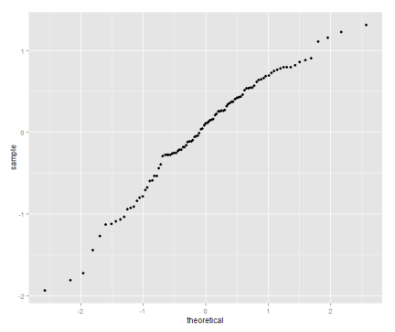
Let’s try the log transform:

model.log.50 <- lm(log(mass50) ~ group + treatment, data=data)
qplot(sample=residuals(model.log.50), stat="qq")
qplot(fitted(model.log.50), residuals(model.log.50))
coefplot(model.log.50)

statplot6

statplot7

coefplot_log50

In both the above models both predictors are categorical. When dealing with categorical predictors, you might prefer the analysis of variance formalism. Anova is the same kind of linear model as regression (but sometimes parameterised slightly differently), followed by F-tests to check whether each predictor explains a significant amount of the variance in the response variable. In all the above models, the categorical variables only have two levels each, so interpretation is easy by just looking a coefficients. When you get to bigger models with lots of levels, F-tests let you test the effect of a ‘batch’ of coefficients corresponding to a variable. To see the (type II, meaning that we test each variable against the model including all other variables) Anova table for a linear model in R, do this:

comb.gnome.anova <- aov(log(mass50) ~ group + treatment, data=data)
drop1(comb.gnome.anova)
Single term deletions

Model:
log(mass50) ~ group + treatment
          Df Sum of Sq     RSS     AIC F value    Pr(>F)    
<none>                  47.005 -67.742                      
group      1    30.192  77.197 -20.627  61.662 5.821e-12 ***
treatment  1    90.759 137.764  36.712 185.361 < 2.2e-16 ***
---
Signif. codes:  0 ‘***’ 0.001 ‘**’ 0.01 ‘*’ 0.05 ‘.’ 0.1 ‘ ’ 1