Using R: plyr to purrr, part 1

This is the second post about my journey towards writing more modern Tidyverse-style R code; here is the previous one. We will look at the common case of taking subset of data out of a data frame, making some complex R object from them, and then extracting summaries from those objects.

More nostalgia about plyr

I miss the plyr package. Especially ddply, ldply, and dlply, my favourite trio of R functions of all times. Yes, the contemporary Tidyverse package dplyr is fast and neat. And those plyr functions operating on arrays were maybe overkill; I seldom used them. But plyr was so smooth, so beautiful, and — after you’ve bashed your head against it for some time and it changed your mind — so intuitive. The package still exists, but it’s retired, and we shouldn’t keep writing R code like it’s 2009, should we?

I used to like to do something like this: take a data frame, push it through a function that returns some complex object, store those objects in a list, and then map various functions over that list to extract the parts I care about. What is the equivalent in the new idiom? To do the same thing but with the purrr package, of course! purrr replaces the list-centric parts of plyr, while dplyr covers data frame-centric summarisation, mutation and so on.

For this example we will be using the lm function on subsets of data and store the model object. It’s the simple case that everyone reaches for to demonstrate these features, but it’s a bit dubious. If you find yourself fitting a lot of linear models to subsets, maybe there are other models you should think about Especially here, when the fake data just happens to come from a multilevel model with varying intercepts … But in this case, let’s simulate a simple linear regression and look at the coefficients we get out.

set.seed(20210807)

n_groups <- 10
group_sizes <- rpois(n_groups, 10)
n <- sum(group_sizes)

fake_data <- tibble(id = 1:n,
                    group = rep(1:n_groups,
                                times = group_sizes),
                    predictor = runif(n, 0, 1))
group_intercept <- rnorm(n_groups, 0, 1)

fake_data$response <- fake_data$predictor * 10 +
  group_intercept[fake_data$group] +
  rnorm(n)

And here is the plyr code: First, dlply takes us from a data frame, splitting it by group, to a list of linear models. Then, ldply takes us from the list of models to a data frame of coefficients. tidy is a function from the wonderful broom package which extracts the same information as you would get in the rather unwieldy object from summary(lm), but as a data frame.

library(plyr)
library(broom)

fit_model <- function(data) {
  lm(response ~ predictor, data)
}

models <- dlply(fake_data,
                     "group",
                     fit_model)
result <- ldply(models, tidy)

This is what the results might looks like. Notice how ldply adds the split labels nicely into the group column, so we know which rows came from which subset.

   group        term   estimate std.error  statistic      p.value
1      1 (Intercept) -0.2519167 0.5757214 -0.4375670 6.732729e-01
2      1   predictor 10.6136902 1.0051490 10.5593207 5.645878e-06
3      2 (Intercept)  3.1528489 0.6365294  4.9531864 7.878498e-04
4      2   predictor  8.2075766 1.1458702  7.1627452 5.292586e-05
5      3 (Intercept) -0.8103777 0.6901212 -1.1742542 2.786901e-01
...

split/map: The modern synthesis

If we pull out purrr, we can get the exact same table like so. The one difference is that we get a tibble (that is, a contemporary, more well-behaved data frame) out of it instead of a base R data.frame.

library(purrr)

models <- map(split(fake_data,
                    fake_data$group),
                    fit_model)
result <- map_df(models,
                 tidy,
                 .id = "group")
# A tibble: 80 x 6
   group term        estimate std.error statistic  p.value
                            
 1 1     (Intercept)     1.67     0.773      2.16 6.32e- 2
 2 1     predictor       8.67     1.36       6.39 2.12e- 4
 3 2     (Intercept)     4.11     0.566      7.26 4.75e- 5
 4 2     predictor       8.19     1.11       7.36 4.30e- 5
 5 3     (Intercept)    -7.50     0.952     -7.89 9.99e- 5
 6 3     predictor      11.5      1.75       6.60 3.03e- 4
 7 4     (Intercept)   -19.8      0.540    -36.7  7.32e-13
 8 4     predictor      11.5      0.896     12.8  5.90e- 8
 9 5     (Intercept)   -12.4      1.03     -12.0  7.51e- 7
10 5     predictor       9.69     1.82       5.34 4.71e- 4
# … with 70 more rows

First, the base function split lets us break the data into subsets based on the values of a variable, which in this case is our group variable. The output of this function is a list of data frames, one for each group.

Second, we use map to apply a function to each element of that list. The function is the same modelling function that we used above, which shoves the data into lm. We now have our list of linear models.

Third, we apply the tidy function to each element of that list of models. Because we want the result to be one single data frame consolidating the output from each element, we use map_df, which will combine the results for us. (If we’d just use map again, we would get a list of data frames.) The .id argument tells map to add the group column that indicates what element of the list of models each row comes from. We want this to be able to identify the coefficients.

If we want to be fancy, we can express with the Tidyverse-related pipe and dot notation:

library(magrittr)

result <- fake_data %>%
  split(.$group) %>%
  map(fit_model) %>%
  map_df(tidy, .id = "group")

Nesting data into list columns

This (minus the pipes) is where I am at in most of my R code nowadays: split with split, apply with map and combine with map_dfr. This works well and looks neater than the lapply/Reduce solution discussed in part 0.

We can push it a step further, though. Why take the linear model out of the data frame, away from its group labels any potential group-level covariates — isn’t that just inviting some kind of mix-up of the elements? With list columns, we could store the groups in a data frame, keeping the data subsets and any R objects we generate from them together. (See Wickham’s & Grolemund’s R for Data Science for a deeper case study of this idea.)

library(dplyr)
library(tidyr)

fake_data_nested <- nest(group_by(fake_data, group),
                         data = c(id, predictor, response))

fake_data_models <- mutate(fake_data_nested,
                           model = map(data,
                                       fit_model),
                           estimates = map(model,
                                           tidy))

result <- unnest(fake_data_models, estimates)

First, we use the nest function to create a data frame where each row is a group, and the ”data” column contains the data for that subset.

Then, we add two list columns to that data frame: our list of models, and then our list of data frames with the coefficients.

Finally, we extract the estimates into a new data frame with unnest. The result is the same data frame of coefficients and statistics, also carrying along the data subsets, linear models and coefficents.

The same code with pipes:

fake_data %>% 
  group_by(group) %>% 
  nest(data = c(id, predictor, response)) %>% 
  mutate(model = map(data, fit_model),
         estimates = map(model, tidy)) %>% 
  unnest(estimates) -> ## right way assignment just for kicks
  result

I’m still a list column sceptic, but I have to concede that this is pretty elegant. It gets the job done, it keeps objects that belong together together so that there is no risk of messing up the order, and it is not that much more verbose. I especially like that we can run the models and extract the coefficients in the same mutate call.

Coda: mixed model

Finally, I can’t resist comparing the separate linear models to a linear mixed model of all the data.

We use lme4 to fit a varying-intercept model, a model that puts the same coefficient on the slope between the response and predictor in each group, but allows the intercepts to vary between groups, assuming them to be drawn from the same normal distribution. We put the coefficients from the linear models fit in each group separately and the linear mixed model together in the same data frame to be able to plot them.

library(ggplot2)
library(lme4)

model <- lmer(response ~ (1|group) + predictor,
              fake_data)

lm_coef <- pivot_wider(result,
                       names_from = term,
                       values_from = estimate,
                       id_cols = group)

lmm_coef <- cbind(group = levels(model@flist$group),
                  coef(model)$group)

model_coef <- rbind(transform(lm_coef, model = "lm"),
                    transform(lmm_coef, model = "lmm"))

colnames(model_coef)[2] <- "intercept"

ggplot() +
  geom_point(aes(x = predictor,
                 y = response,
                 colour = factor(group)),
             data = fake_data) +
  geom_abline(aes(slope = predictor,
                  intercept = intercept,
                  colour = factor(group),
                  linetype = model),
              data = model_coef) +
  theme_bw() +
  theme(panel.grid = element_blank())

As advertised, the linear mixed model has the same slope in every group, and intercepts pulled closer to the mean. Now, we know that this is a good model for these fake data because we created them, and in the real world, that is obviously not the case … The point is: if we are going to fit a more complex model of the whole data, we want to be able to explore alternatives and plot them together with the data. Having elegant ways to transform data frames and summarise models at our disposal makes that process smoother.

A plot of genes on chromosomes

Marta Cifuentes and Wayne Crismani asked on Twitter if there is a web tool similar to the Arabidopsis Chromosome Map Tool that makes figures of genes on chromosomes for humans. This will not really be an answer to the question — not a web tool, not conveniently packaged — but I thought that would be a nice plot to make in R with ggplot2. We will use the ggrepel package to help with labelling, and get information from the Ensembl REST API with httr and jsonlite.

The plot and the final code to generate it

Below I will go through the functions that get us there, but here is the end product. The code is on GitHub as usual.

## Some Ensembl genes to test with

ensembl_genes <- c("ENSG00000125845", ## BMP2
                   "ENSG00000181690", ## PLAG1
                   "ENSG00000177508", ## IRX3
                   "ENSG00000140718") ## FTO

chr_sizes <- get_chromosome_sizes_from_ensembl(species = "homo_sapiens")

coords <- get_coordinates_from_ensembl(ensembl_genes)

plot_genes_test <- plot_genes(coords,
                              chr_sizes)

We will use Ensembl and access the genes via Ensembl Gene IDs. Here, I’ve looked up the Ensembl Gene IDs for four genes I like (in humans).

We need to know how long human chromosomes are in order to plot them, so we have a function for that; we also need to get coordinates for the genes, and we have a function for that. They are both below. These functions call up the Ensembl REST API to get the data from the Ensembl database.

Finally, there is a plotting function that takes the coordinates and the chromosome sizes as input and return a ggplot2 plot.

Getting the data out of the Ensembl REST API

Now, starting from the top, we will need to define those functions to interact with the Ensembl REST API. This marvellous machine allows us to get data out of the Ensembl database over HTTP, writing our questions in the URL. It is nicely described with examples from multiple languages on the Ensembl REST API website.

An alternative to using the REST API would be to download gene locations from BioMart. This was my first thought. BioMart is more familiar to me than the REST API, and it also has the nice benefit that it is easy to download every gene and store it away for the future. However, there isn’t a nice way to get chromosome lengths from BioMart, so we would have to download them from somewhere else. This is isn’t hard, but I thought using the REST API for both tasks seemed nicer.

## Plot showing the location of a few genomes on chromosomes

library(httr)
library(jsonlite)
library(ggplot2)
library(ggrepel)
library(purrr)

## Get an endpoint from the Ensembl REST api and return parsed JSON

get_from_rest_api <- function(endpoint_string,
                              server = "https://rest.ensembl.org/") {
  rest <- GET(paste(server, endpoint_string, sep = ""),
              content_type("application/json"))
  
  stop_for_status(rest)
  
  fromJSON(toJSON(content(rest)))
}

This first function gets content by sending a request, checking whether it worked (and stopping with an error if it didn’t), and then unpacking the content into an R object.

## Get chromosomes sizes from the Ensembl REST API

get_chromosome_sizes_from_ensembl <- function(species) {

  json <- get_from_rest_api(paste("info/assembly/", species, sep = ""))

  data.frame(name = as.character(json$top_level_region$name),
             length = as.numeric(json$top_level_region$length),
             stringsAsFactors = FALSE)
}

This second function asks for the genome assembly information for a particular species with the GET info/assembly/:species endpoint, and extracts the chromosome lengths into a data frame. The first part of data gathering is done, now we just need the coordinates fort the genes of interest.

## Get coordinates from Ensembl ids

get_coordinates_from_ensembl <- function(ensembl_ids) {
 
  map_dfr(ensembl_ids,
          function(ei) {
            json <- get_from_rest_api(paste("lookup/id/", ei, sep = ""))
            
            data.frame(position = (json$start + json$end)/2,
                       chr = json$seq_region_name,
                       display_name = json$display_name,
                       stringsAsFactors = FALSE)
          })
}

This function asks for the gene information for each gene ID we’ve given it with the GET lookup/id/:id endpoint, and extracts the rough position (mean of start and end coordinate), chromosome name, and the ”display name”, which in the human case will be a gene symbol. (For genes that don’t have a gene symbol, we would need to set up this column ourselves.)

At this point, we have the data we need in two data frames. That means it’s time to make the plot.

Plotting code

We will build a plot with two layers: first the chromosomes (as a geom_linerange) and then the gene locations (as a geom_text_repel from the ggrepel package). The text layer will move the labels around so that they don’t overlap even when the genes are close to each other, and by setting the nudge_x argument we can move them to the side of the chromosomes.

Apart from that, we change the scale to set he order of chromosomes and reverse the scale of the y-axis so that chromosomes start at the top of the plot.

The function returns a ggplot2 plot object, so one can do some further customisation after the fact — but for some features one would have to re-write things inside the function.

plot_genes <- function(coordinates,
                       chromosome_sizes) {

  ## Restrict to chromosomes that are in data  
  chrs_in_data <-
    chromosome_sizes[chromosome_sizes$name %in% coordinates$chr,]
  chr_order <- order(as.numeric(chrs_in_data$name))
  
  ggplot() +
    geom_linerange(aes(x = name,
                       ymin = 1,
                       ymax = length/1e6),
                   size = 2,
                   colour = "grey",
                   data = chrs_in_data) +
    geom_text_repel(aes(x = chr,
                        y = position/1e6,
                        label = display_name),
                    nudge_x = 0.33,
                    data = coordinates) +
    scale_y_reverse() +
    ## Fix ordering of chromosomes on x-axis
    scale_x_discrete(limits = chrs_in_data$name[chr_order],
                     labels = chrs_in_data$name[chr_order]) +
    theme_bw() +
    theme(panel.grid = element_blank()) +
    xlab("Chromosome") +
    ylab("Position (Mbp)")
  
}

Possible extensions

One feature from the Arabidopsis inspiration that is missing here is the position of centromeres. We should be able to use the option ?bands=1 in the GET info/assembly/:species to get cytogenetic band information and separate p and q arms of chromosomes. This will not be universal though, i.e. not available for most species I care about.

Except to make cartoons of gene positions, I think this might be a nice way to make plots of genome regions with very course resolution, i.e. linkage mapping results, where one could add lines to show genomic confidence intervals, for example.

Showing a difference in mean between two groups, take 2

A couple of years ago, I wrote about the paradoxical difficulty of visualising a difference in means between two groups, while showing both the data and some uncertainty interval. I still feel like many ills in science come from our inability to interpret a simple comparison of means. Anything with more than two groups or a predictor that isn’t categorical makes things worse, of course. It doesn’t take much to overwhelm the intuition.

My suggestion at the time was something like this — either a panel that shows the data an another panel with coefficients and uncertainty intervals; or a plot that shows the with lines that represent the magnitude of the difference at the upper and lower limit of the uncertainty interval.

Alternative 1 (left), with separate panels for data and coefficient estimates, and alternative 2 (right), with confidence limits for the difference shown as vertical lines. For details, see the old post about these graphs.

Here is the fake data and linear model we will plot. If you want to follow along, the whole code is on GitHub. Group 0 should have a mean of 4, and the difference between groups should be two, and as the graphs above show, our linear model is not too far off from these numbers.

library(broom)

data <- data.frame(group = rep(0:1, 20))
data$response <- 4 + data$group * 2 + rnorm(20)

model <- lm(response ~ factor(group), data = data)
result <- tidy(model)

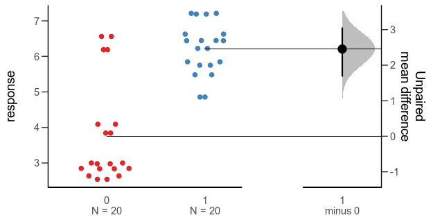
Since the last post, a colleague has told me about the Gardner-Altman plot. In a paper arguing that confidence intervals should be used to show the main result of studies, rather than p-values, Gardner & Altman (1986) introduced plots for simultaneously showing confidence intervals and data.

Their Figure 1 shows (hypothetical) systolic blood pressure data for a group of diabetic and non-diabetic people. The left panel is a dot plot for each group. The right panel is a one-dimensional plot (with a different scale than the right panel; zero is centred on the mean of one of the groups), showing the difference between the groups and a confidence interval as a point with error bars.

There are functions for making this kind of plot (and several more complex alternatives for paired comparisons and analyses of variance) in the R package dabestr from Ho et al. (2019). An example with our fake data looks like this:

Alternative 3: Gardner-Altman plot with bootstrap confidence interval.

library(dabestr)

bootstrap <- dabest(data,
                    group,
                    response,
                    idx = c("0", "1"),
                    paired = FALSE)

bootstrap_diff <- mean_diff(bootstrap)

plot(bootstrap_diff)

While this plot is neat, I think it is a little too busy — I’m not sure that the double horizontal lines between the panels or the shaded density for the bootstrap confidence interval add much. I’d also like to use other inference methods than bootstrapping. I like how the scale of the right panel has the same unit as the left panel, but is offset so the zero is at the mean of one of the groups.

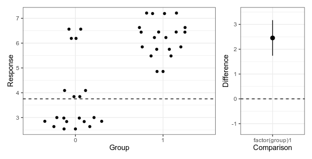
Here is my attempt at making a minimalistic version:

Alternative 4: Simplified Garner-Altman plot.

This piece of code first makes the left panel of data using ggbeeswarm (which I think looks nicer than the jittering I used in the first two alternatives), then the right panel with the estimate and approximate confidence intervals of plus/minus two standard errors of the mean), adjusts the scale, and combines the panels with patchwork.

library(ggbeeswarm)
library(ggplot2
library(patchwork)

ymin <- min(data$response)
ymax <- max(data$response)

plot_points_ga <- ggplot() +
  geom_quasirandom(aes(x = factor(group), y = response),
                   data = data) +
  xlab("Group") +
  ylab("Response") +
  theme_bw() +
  scale_y_continuous(limits = c(ymin, ymax))

height_of_plot <- ymax-ymin

group0_fraction <- (coef(model)[1] - ymin)/height_of_plot

diff_min <- - height_of_plot * group0_fraction

diff_max <- (1 - group0_fraction) * height_of_plot

plot_difference_ga <- ggplot() +
  geom_pointrange(aes(x = term, y = estimate,
                      ymin = estimate - 2 * std.error,
                      ymax = estimate + 2 * std.error),
                  data = result[2,]) +
  scale_y_continuous(limits = c(diff_min, diff_max)) +
  ylab("Difference") +
  xlab("Comparison") +
  theme_bw()

(plot_points_ga | plot_difference_ga) +
    plot_layout(widths = c(0.75, 0.25))

Literature

Gardner, M. J., & Altman, D. G. (1986). Confidence intervals rather than P values: estimation rather than hypothesis testing. British Medical Journal

Ho, J., Tumkaya, T., Aryal, S., Choi, H., & Claridge-Chang, A. (2019). Moving beyond P values: data analysis with estimation graphics. Nature methods.

Using R: setting a colour scheme in ggplot2

Note to self: How to quickly set a colour scheme in ggplot2.

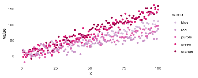
Imagine we have a series of plots that all need a uniform colour scale. The same category needs to have the same colour in all graphics, made possibly with different packages and by different people. Instead of hard-coding the colours and the order of categories, we can put them in a file, like so:

library(readr)
colours <- read_csv("scale_colours.csv")
# A tibble: 5 x 2
  name   colour 
      
1 blue   #d4b9da
2 red    #c994c7
3 purple #df65b0
4 green  #dd1c77
5 orange #980043

Now a plot with default colours, using some made-up data:

x <- 1:100

beta <- rnorm(5, 1, 0.5)

stroop <- data.frame(x,
                     sapply(beta, function(b) x * b + rnorm(100, 1, 10)))
colnames(stroop)[2:6] <- c("orange", "blue", "red", "purple", "green") 

data_long <- pivot_longer(stroop, -x)

plot_y <- qplot(x = x,
                y = value,
                colour = name,
                data = data_long) +
  theme_minimal() +
  theme(panel.grid = element_blank())

Now we can add the custom scale like this:

plot_y_colours <- plot_y + 
  scale_colour_manual(limits = colours$name,
                      values = colours$colour)


Using R: simple Gantt chart with ggplot2

Jeremy Yoder’s code for a simple Gantt chart on the Molecular Ecologist blog uses geom_line and gather to prepare the data structure. I like using geom_linerange and a coord_flip, which lets you use start and end columns directly without pivoting.

Here is a very serious data frame of activities:

# A tibble: 6 x 4
  activity       category        start               end                
                                                  
1 Clean house    preparations    2020-07-01 00:00:00 2020-07-03 00:00:00
2 Pack bags      preparations    2020-07-05 10:00:00 2020-07-05 17:00:00
3 Run to train   travel          2020-07-05 17:00:00 2020-07-05 17:15:00
4 Sleep on train travel          2020-07-05 17:15:00 2020-07-06 08:00:00
5 Procrastinate  procrastination 2020-07-01 00:00:00 2020-07-05 00:00:00
6 Sleep          vacation        2020-07-06 08:00:00 2020-07-09 00:00:00

And here is the code:


library(ggplot2)
library(readr)

activities <- read_csv("activities.csv")

## Set factor level to order the activities on the plot
activities$activity <- factor(activities$activity,
                              levels = activities$activity[nrow(activities):1])
    
plot_gantt <- qplot(ymin = start,
                    ymax = end,
                    x = activity,
                    colour = category,
                    geom = "linerange",
                    data = activities,
                    size = I(5)) +
    scale_colour_manual(values = c("black", "grey", "purple", "yellow")) +
    coord_flip() +
    theme_bw() +
    theme(panel.grid = element_blank()) +
    xlab("") +
    ylab("") +
    ggtitle("Vacation planning")

Using R: 10 years with R

Yesterday, 29 Feburary 2020, was the 20th anniversary of the release R 1.0.0. Jozef Hajnala’s blog has a cute anniversary post with some trivia. I realised that it is also (not to the day, but to the year) my R anniversary.

I started using R in 2010, during my MSc project in Linköping. Daniel Nätt, who was a PhD student there at the time, was using it for gene expression and DNA methylation work. I think that was the reason he was pulled into R; he needed the Bioconductor packages for microarrays. He introduced me. Thanks, Daniel!

I think I must first have used it to do something with qPCR melting curves. I remember that I wrote some function to reshape/pivot data between long and wide format. It was probably an atrocity of nested loops and hard bracket indexing. Coming right from an undergraduate programme with courses using Ada and C++, even if we had also used Minitab for statistics and Matlab for engineering, I spoke R with a strong accent. At any rate, I was primed to think that doing my data analysis with code was a good idea, and jumped at the opportunity to learn a tool for it. Thanks, undergraduate programme!

I think the easiest thing to love about R is the package system. You can certainly end up in dependency hell with R and metaphorically shoot your own foot, especially on a shared high performance computing system. But I wouldn’t run into any of that until after several years. I was, and still am, impressed by how packages just worked, and could do almost anything. So, the Bioconductor packages were probably, indirectly, why I was introduced to R, and after that, my R story can be told in a series of packages. Thanks, CRAN!

The next package was R/qtl, that I relied on for my PhD. I had my own copy of the R/qtl book. For a period, I probably wrote thing every day:

library(qtl)

cross <- read.cross(file = "F8_geno_trim.csv", format = "csv")

R/qtl is one of my favourite pieces or research software, relatively friendly and with lots of documentation. Thanks, R/qtl developers!

Of course it was Dom Wright, who was my PhD supervisor, who introduced me to R/qtl, and I think it was also he who introduced me to ggplot2. At least he used it, and at some point we were together trying to fix the formatting of a graph, probably with some ugly hack. I decided to use ggplot2 as much as possible, and as it is wont to, ggplot2 made me care about rearranging data, thus leading to reshape2 and plyr. ”The magic is not in plotting the data but in tidying and rearranging the data for plotting.” After a while, most everything I wrote used the ddply function in some way. Thank you, Hadley Wickham!

Then came the contemporary tidyverse. For the longest time, I was uneasy with tidyr, and I’m still not a regular purrr user, but one can’t avoid loving dplyr. How much? My talk at the Swedish Bioinformatics Workshop in 2016 had a slide expressing my love of the filter function. It did not receive the cheers that the function deserves. Maybe the audience were Python users. With new file reading functions, new data frames and functions to manipulate data frames, modern R has become smoother and friendlier. Thanks, tidyverse developers!

The history of R on this blog started in 2011, originally as a way to make notes for myself or, ”a fellow user who’s trying to google his or her way to a solution”. This turned into a series of things to help teach R to biologists around me.

There was the Slightly different introduction to R series of blog posts. It used packages that feel somewhat outdated, and today, I don’t think there’s anything even slightly different about advocating RStudio, and teaching ggplot2 from the beginning.

This spawned a couple of seminars in course for PhD students, which were updated for the Wright lab computation lunches, and eventually turned into a course of its own given in 2017. It would be fun to update it and give it again.

The last few years, I’ve been using R for reasonably large genome datasets in a HPC environment, and gotten back to the beginnings, I guess, by using Bioconducor a lot more. However, the package that I think epitomises the last years of my R use is AlphaSimR, developed by colleagues in Edinburgh. It’s great to be able throw together a quick simulation to check how some feature of genetics behaves. AlphaSimR itself is also an example of how far the R/C++ integration has come with RCpp and RCppArmadillo. Thanks, Chris!

In summary, R is my tool of choice for almost anything. I hope we’ll still be using it, in new and interesting ways, in another ten years. Thank you, R core team!

#TidyTuesday: horror films, squirrels and commuters

Tidy Tuesday is a fun weekly activity where a lot of R enthusiasts make different visualisations, and possibly modelling, of the same dataset. You can read more about it at their Github page. I participated for three weeks, and here is a recap. I will show excerpts of the code, but you can read the whole thing by clicking through to Github.

2019-10-22 Horror films

Data: https://github.com/rfordatascience/tidytuesday/tree/master/data/2019/2019-10-22

My code: https://github.com/mrtnj/rstuff/blob/master/tidytuesday/horror_movies.R

In time for Halloween, we got a dataset with horror film data from IMDB. (Yes, I will be mixing the terms ”film” and ”movie” wildly.)

The first week, I started with making a pretty boring plot, the way I’d normally plot things (white background, small multiples, you know the drill). I wanted to look at distribution over the year, so I plotted what month films are released and the distribution of review scores and budgets each month. After thinking about it for a while, I thought a logarithmic scale would make sense for budgets, that span a huge range. Also, after realising that the budget column actually didn’t contain dollars, but a mix of currencies, I decided not to try to convert, but use only the US dollar budgets.

I don’t often run into dates, to using the date functions from readr and lubridate was new to me, as was the built-in vector month.abb:

library(dplyr)
library(egg)
library(ggplot2)
library(ggimage)
library(lubridate)
library(readr)
library(stringr)

movies <- read_csv("horror_movies.csv")

## Parse dates

movies$release_parsed  <- parse_date(movies$release_date,
                                     format = "%d-%b-%y",
                                     locale = locale("en")) 

movies$release_year <- ifelse(is.na(movies$release_parsed),
                              movies$release_date,
                              year(movies$release_parsed))

movies$release_month  <- month.abb[month(movies$release_parsed)]

Here, we parse the release data, and extract the release year, treating films that only have a release year separately.

I also put in means with confidence intervals, like so, and a line for the mean review rating:

model  <- lm(review_rating ~ release_month, movies)

fit  <- data.frame(release_month = month.abb,
                   predict(model,
                           newdata = data.frame(release_month = month.abb),
                                                interval = "confidence"),
                   stringsAsFactors = FALSE)

grand_mean_rating  <- mean(movies$review_rating,
                           na.rm = TRUE)

As an example of the plotting code, here is the middle panel for ratings. As usual with ggplot2, we layer geometries on top of each other (here: violin plots, points with range bars, and a horizontal line, followed by a lot of formatting.

plot_rating <- ggplot() +
    geom_violin(aes(x = release_month,
                    y = review_rating),
                fill = "grey",
                colour = NA,
                data = movies) +
    scale_x_discrete(limits = month.abb) +
    geom_pointrange(aes(x = release_month,
                        y = fit,
                        ymax = upr,
                        ymin = lwr),
                    data = fit) +
    geom_hline(yintercept = grand_mean_rating,
               linetype = 2,
               colour = "red") +
    ylim(0, 10) +
    theme_bw(base_size = 12) +
    theme(panel.grid = element_blank()) +
    xlab("") +
    ylab("Review rating")

There is similar code for the other two panels. Finally, I used ggarrange from the egg package to put everything together. In summary, most horror films are released in October, probably around Halloween. The review ratings of films released in this horror season are also a tiny bit higher than during the rest of the year, but there is not much of a difference in the budgets.

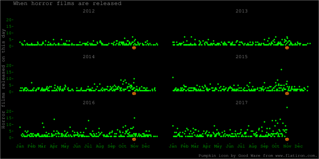
After that, and after seeing some of the fun horror-themed graphs other people made, I decided to make something more colourful. Here is a plot on the same theme, showing each day and year separately, an appropriately horrendous colour scheme, and a pumpkin icon to indicate the date of Halloween. I like this plot better because it shows more of the data. It shows the increase at Halloween. We also see some spikes at other dates, like 1 January of some years. It also shows how the dataset ends at Halloween 2017.

The code for this plot is mostly a lot of theme formatting. The ggplot2 theme function takes a lot of arguments I’ve never used before.

movies$yday  <- yday(movies$release_parsed)

daycount <- summarise(group_by(movies, yday, release_year), n = n())

First, we turn dates into days of the year, and count the number of film releases.

halloween  <-  yday("2019-10-31")

pumpkin_data  <- data.frame(x = halloween,
                            y = -1,
                            image = "pumpkin.png",
                            stringsAsFactors = FALSE)

Then, we set up the date of Halloween and a data frame for the pumpkin icon. We’re going to use geom_image from the ggimage package to add this icon to each subplot.

breaks  <- yday(paste("2019-", 1:12, "-01", sep = ""))

plot_year <- ggplot() +
    geom_point(aes(x = yday,
                   y = n),
               colour = "green",
               data = na.exclude(dc)) +
    geom_image(aes(x = x,
                   y = y,
                   image = image),
               data = pumpkin_data) +
    facet_wrap(~ release_year,
               ncol = 2) +
    scale_x_continuous(breaks = breaks,
                       labels = month.abb) +
    ylim(-3, NA) +
    labs(caption = "Pumpkin icon by Good Ware from www.flatiron.com.") +
    theme(panel.grid = element_blank(),
          strip.background = element_blank(),
          text = element_text(family = "mono",
                              colour = "grey",
                              size = 16),
          axis.text = element_text(family = "mono",
                                   colour = "green",
                                   size = 14),
          axis.ticks = element_line(colour = "green"),
          strip.text = element_text(family = "mono",
                                    colour = "grey",
                                    size = 16),
          plot.background = element_rect(fill = "black"),
          panel.background = element_rect(fill = "black")) +
    xlab("") +
    ylab("Horror films released on this day") +
    ggtitle("When horror films are released")

A lot of other people made graphs that highlight the increase in horror film releases around Halloween in different ways. Here are some that I like:

https://twitter.com/veerlevanson/status/1187770362588811266

And, looking deeper, there is a pattern within months too:

Finally, I also like this plot, that makes a case for a U-shaped relationship between budget and rating:

And for contrast, another that makes a different case with the same data:

This seems to be a recurrent theme when it comes to interpretation and quantitative analysis in the Tidy Tuesday datasets. People make different modeling choices, or visualisation choices (which are modeling choices) about what to lump together, what to separate into bins, how to transform the data, and how to show uncertainty. In some cases, as with the pattern of film releases around Halloween, they all find similar results. In some other cases, they don’t.

2019-10-28 NYC Squirrel Census

Data: https://github.com/rfordatascience/tidytuesday/tree/master/data/2019/2019-10-29

My code: https://github.com/mrtnj/rstuff/blob/master/tidytuesday/nyc_squirrels.R

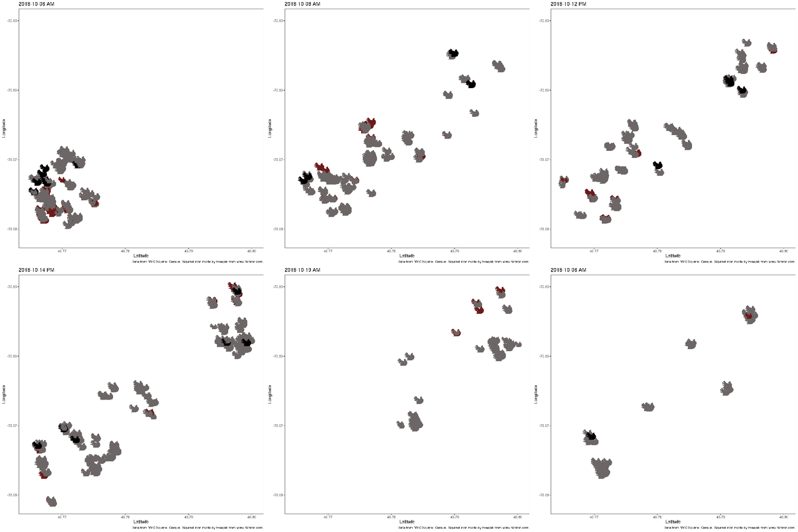
This week, the data was about the location and activities of squirrels in New York central park on certain times. I had this vision of an animated map of squirrel locations. I ended up with an animation, but no map. The colour of the squirrel icon shows the main fur colour of the squirrels (grey, black, cinnamon), and the size shows adults and juveniles.

I had never used gganimate before (only animation, as in this post about the Game of Life), but I had seen Thomas Lin Pedersen tweet about it, and I wanted to try.

library(dplyr)
library(gganimate)
library(ggimage)
library(ggplot2)
library(readr)

squirrels <- read_csv("nyc_squirrels.csv")

## Parse the date
squirrels$date_parsed  <- parse_date(as.character(squirrels$date), format = "%m%d%Y")

## Give each observation a unique ID (to use as group in the
## animation, so as to not have points turn into one another but fade
## instead.
squirrels$key  <- 1:nrow(squirrels)

## Associate the different squirrel colours with the filenames of
## icons in different colours (manually filled with GIMP).
squirrels$image  <- "squirrel.png"
squirrels$image[squirrels$primary_fur_color == "Cinnamon"]  <- "squirrel_cinnamon.png"
squirrels$image[squirrels$primary_fur_color == "Gray"]  <- "squirrel_grey.png"
squirrels$image[is.na(squirrels$primary_fur_colour)]  <- NA

Again, we need to parse the date. We already have latitude and longitude. We need a unique identifier for each observation, to tell gganimate that we want each squirrel to be in its own group. Then, we associate squirrel colours with three different files with a squirrel icon in different colours.

First, we make two image scatterplot layers, setting the sizes of adults and juveniles manually. The colour is deal with by mapping the image column containing the file names to the image aesthetic. We add some formatting, and then, the transition_states layer, which is where the graph turns from still and boring to magical moving pictures. This will animate a series of discrete ”states”, which here consist of the date pasted together with the shift (AM or PM squirrel observation shift). The special ”{closest_state}” variable in the title string puts this state name as plot title.

plot_colour <- ggplot() +
    geom_image(aes(y = long, x = lat, image = image, group = key),
               size = 0.04,
               data = filter(squirrels, age == "Adult")) +
    geom_image(aes(y = long, x = lat, image = image, group = key),
               size = 0.03,
               data = filter(squirrels, age == "Juvenile")) +
    theme_bw(base_size = 16) +
    theme(panel.grid = element_blank()) +
    xlab("Latitude") +
    ylab("Longitude") +
    labs(title = "{closest_state}",
         caption = "Data from NYC Squirrel Census. Squirrel icon made by Freepik from www.flatiron.com.") +
    transition_states(paste(date_parsed, shift),
                      state_length = 2,
                      transition_length = 1)

## Render it and write to file
animate(plot_colour,
        fps = 10,
        nframes = 400,
        end_pause = 20,
        rewind = FALSE,
        width = 1000,
        height = 1000)

I was faffing around unsuccessfully with different map packages to try to find something of Central Park. It seems ggmaps is the way to go. Several other participants made nice maps:

However, I think this was my favourite:

https://github.com/ryantimpe/TidyTuesday/blob/master/2019w44/2019w44.R

The original Squirrel Census Report seems to be amazing object, too, with a beautiful map.

2019-11-05 Biking and walking to work in the US (and Sweden)

Data: https://github.com/rfordatascience/tidytuesday/tree/master/data/2019/2019-11-05

My code: https://github.com/mrtnj/rstuff/blob/master/tidytuesday/commute.R

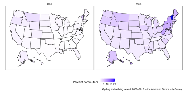
This week I felt I had to make a map. The end result doesn’t look like much, but it took a while. Here are the average percentages of commuters who walk and bike to work in different US states 2008-2012 with data from the American Community Survey:

library(dplyr)
library(ggplot2)
library(readr)
library(usmap)

commute <- read_csv("commute.csv")

## Map data from the usmap package
state_map  <- us_map(regions = "state")

## There are some incompletely labelled states; fix them
missing  <- setdiff(commute$state, state_map$full)

commute$state_modified <- commute$state
commute$state_modified[commute$state == "Ca"] <- "California"
commute$state_modified[commute$state == "Massachusett"]  <- "Massachusetts"

We get map coordinates for the US states from the usmap package (because the one in maps doesn’t have Alaska and Hawaii).

Then we fix some mislabelling in the data.

## Get the average per state
state_average  <- summarise(group_by(commute, state_modified, mode),
                            average = sum(percent * n)/sum(n))

## Combine averages and coordinates
combined  <- inner_join(state_average,
                        state_map,
                        by = c("state_modified" = "full"))

We take a weighted average of the percentages per state and join the state averages with the state map coordinates. The map I posted on Twitter didn’t weight the average, but I think that is a bit better. There is still the issue that states have different populations and different distributions of large and small cities, but that’s the nature of things. In summary, there is not much biking going on, but some more walking to work.

plot_map  <- ggplot() +
    geom_polygon(aes(x = x, y = y, fill = average, group = group),
                 colour = "black",
                 data = combined) +
    facet_wrap(~ mode) +
    scale_fill_continuous(low = "white",
                          high = "blue",
                          name = "Percent commuters") +
    theme_bw(base_size = 16) +
    theme(panel.grid = element_blank(),
          strip.background = element_blank(),
          axis.text = element_blank(),
          axis.ticks = element_blank(),
          legend.position = "bottom") +
    xlab("") +
    ylab("") +
    labs(caption = "Cycling and walking to work 2008-2012 in the American Community Survey.")

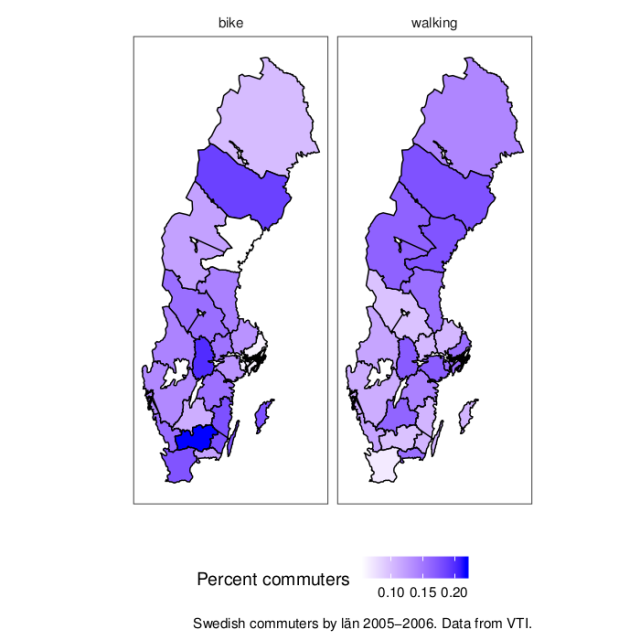
The US seems to live up to its reputation as a motorised country. But I have no feeling for the scale of the data. For comparision, here is a map of Sweden with some not too recent data (2005-2006, from this VTI report>). The map is from the swemap package.

Using R: Correlation heatmap with ggplot2

(This post was originally written on 2013-03-23. Since then, it has persistently remained one of my most visited posts, and I’ve decided to revisit and update it. I may do the same to some other old R-related posts that people still arrive on through search engines. There was also this follow-up, which I’ve now incorporated here.)

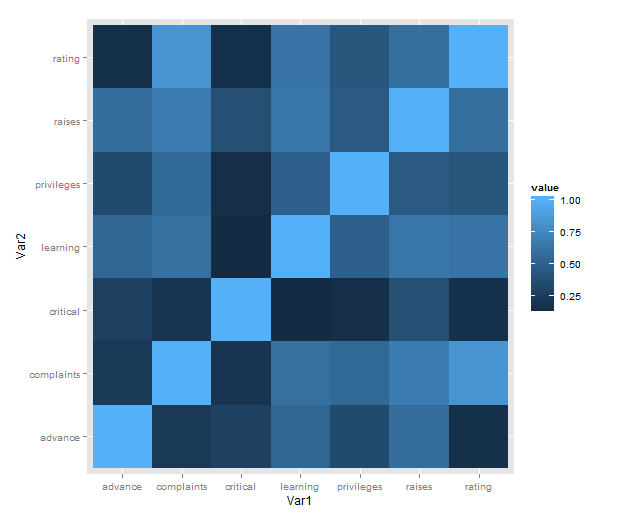
Just a short post to celebrate when I learned how incredibly easy it is to make a heatmap of correlations with ggplot2 (with some appropriate data preparation, of course). Here is a minimal example using the reshape2 package for preparation and the built-in attitude dataset:

library(ggplot2)
library(reshape2)
qplot(x = Var1, y = Var2,
      data = melt(cor(attitude)),
      fill = value,
      geom = "tile")

attitude_heatmap

What is going on in that short passage?

  • cor makes a correlation matrix with all the pairwise correlations between variables (twice; plus a diagonal of ones).
  • melt takes the matrix and creates a data frame in long form, each row consisting of id variables Var1 and Var2 and a single value.
  • We then plot with the tile geometry, mapping the indicator variables to rows and columns, and value (i.e. correlations) to the fill colour.

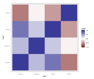
However, there is one more thing that is really need, even if just for the first quick plot one makes for oneself: a better scale. The default scale is not the best for correlations, which range from -1 to 1, because it’s hard to tell where zero is. Let’s use the airquality dataset for illustration as it actually has some negative correlations. In ggplot2, a scale that has a midpoint and a different colour in each direction is called scale_colour_gradient2, and we just need to add it. I also set the limits to -1 and 1, which doesn’t change the colour but fills out the legend for completeness. Done!

data <- airquality[,1:4]
qplot(x = Var1, y = Var2,
      data = melt(cor(data, use = "p")),
      fill = value,
      geom = "tile") +
   scale_fill_gradient2(limits = c(-1, 1))

correlation_heatmap2

Finally, if you’re anything like me, you may be phasing out reshape2 in favour of tidyr. If so, you’ll need another function call to turn the matrix into a data frame, like so:

library(tidyr)

correlations <- data.frame(cor(data, use = "p"))
correlations$Var1 <- rownames(correlations)
melted <- gather(correlations, "value", "Var2", -Var1)

qplot(x = Var1, y = Var2,
      data = melted,
      fill = value,
      geom = "tile") +
   scale_fill_gradient2(limits = c(-1, 1))

The data preparation is no longer a oneliner, but, honestly, it probably shouldn’t be.

Okay, you won’t stop reading until we’ve made a solution with pipes? Sure, we can do that! It will be pretty gratuitous and messy, though. From the top!

library(magrittr)

airquality %>%
    '['(1:4) %>%
    data.frame %>%
    transform(Var1 = rownames(.)) %>%
    gather("Var2", "value", -Var1) %>%
    ggplot() +
        geom_tile(aes(x = Var1,
                      y = Var2,
                      fill = value)) +
        scale_fill_gradient2(limits = c(-1, 1))

‘Simulating genetic data with R: an example with deleterious variants (and a pun)’

A few weeks ago, I gave a talk at the Edinburgh R users group EdinbR on the RAGE paper. Since this is an R meetup, the talk concentrated on the mechanics of genetic data simulation and with the paper as a case study. I showed off some of what Chris Gaynor’s AlphaSimR can do, and how we built on that to make the specifics of this simulation study. The slides are on the EdinbR Github.

Genetic simulation is useful for all kinds of things. Sure, they’re only as good as the theory that underpins them, but the willingness to try things out in simulations is one of the things I always liked about breeding research.

This is my description of the logic of genetic simulation: we think of the genome as a large table of genotypes, drawn from some distribution of allele frequencies.

To make an utterly minimal simulation, we could draw allele frequencies from some distribution (like a Beta distribution), and then draw the genotypes from a binomial distribution. Done!

However, there is a ton of nuance we would like to have: chromosomes, linkage between variants, sexes, mating, selection …

AlphaSimR addresses all of this, and allows you to throw individuals and populations around to build pretty complicated designs. Here is the small example simulation I used in the talk.


library(AlphaSimR)
library(ggplot2)

## Generate founder chromsomes

FOUNDERPOP <- runMacs(nInd = 1000,
                      nChr = 10,
                      segSites = 5000,
                      inbred = FALSE,
                      species = "GENERIC")


## Simulation parameters

SIMPARAM <- SimParam$new(FOUNDERPOP)
SIMPARAM$addTraitA(nQtlPerChr = 100,
                   mean = 100,
                   var = 10)
SIMPARAM$addSnpChip(nSnpPerChr = 1000)
SIMPARAM$setGender("yes_sys")


## Founding population

pop <- newPop(FOUNDERPOP,
              simParam = SIMPARAM)

pop <- setPheno(pop,
                varE = 20,
                simParam = SIMPARAM)


## Breeding

print("Breeding")
breeding <- vector(length = 11, mode = "list")
breeding[[1]] <- pop

for (i in 2:11) {
    print(i)
    sires <- selectInd(pop = breeding[[i - 1]],
                       gender = "M",
                       nInd = 25,
                       trait = 1,
                       use = "pheno",
                       simParam = SIMPARAM)

    dams <- selectInd(pop = breeding[[i - 1]],
                      nInd = 500,
                      gender = "F",
                      trait = 1,
                      use = "pheno",
                      simParam = SIMPARAM)

    breeding[[i]] <- randCross2(males = sires,
                                females = dams,
                                nCrosses = 500,
                                nProgeny = 10,
                                simParam = SIMPARAM)
    breeding[[i]] <- setPheno(breeding[[i]],
                              varE = 20,
                              simParam = SIMPARAM)
}


## Look at genetic gain and shift in causative variant allele frequency

mean_g <- unlist(lapply(breeding, meanG))
sd_g <- sqrt(unlist(lapply(breeding, varG)))

plot_gain <- qplot(x = 1:11,
                   y = mean_g,
                   ymin = mean_g - sd_g,
                   ymax = mean_g + sd_g,
                   geom = "pointrange",
                   main = "Genetic mean and standard deviation",
                   xlab = "Generation", ylab = "Genetic mean")

start_geno <- pullQtlGeno(breeding[[1]], simParam = SIMPARAM)
start_freq <- colSums(start_geno)/(2 * nrow(start_geno))

end_geno <- pullQtlGeno(breeding[[11]], simParam = SIMPARAM)
end_freq <- colSums(end_geno)/(2 * nrow(end_geno))

plot_freq_before <- qplot(start_freq, main = "Causative variant frequency before") 
plot_freq_after <- qplot(end_freq, main = "Causative variant frequency after") 

This code builds a small livestock population, breeds it for ten generations, and looks at the resulting selection response in the form of a shift of the genetic mean, and the changes in the underlying distribution of causative variants. Here are the resulting plots:

What single step does with relationship

We had a journal club about the single step GBLUP method for genomic evaluation a few weeks ago. In this post, we’ll make a few graphs of how the single step method models relatedness between individuals.

Imagine you want to use genomic selection in a breeding program that already has a bunch of historical pedigree and trait information. You could use some so-called multistep evaluation that uses one model for the classical pedigree + trait quantitative genetics and one model for the genotype + trait genomic evaluation, and then mix the predictions from them together. Or you could use the single-step method, which combines pedigree, genotypes and traits into one model. It does this by combining the relationship estimates from pedigree and genotypes. That matrix can then go into your mixed model.

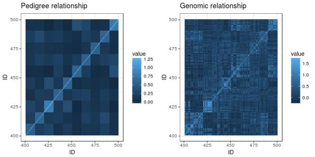
We’ll illustrate this with a tiny simulated population: five generations of 100 individuals per generation, where ten random pairings produce the next generation, with families of ten individuals. (The R code is on Github and uses AlphaSimR for simulation and AGHmatrix for matrices). Here is a heatmap of the pedigree-based additive relationship matrix for the population:

What do we see? In the lower left corner are the founders, and not knowing anything about their heritage, the matrix has them down as unrelated. The squares of high relatedness along the diagonal are the families in each generation. As we go upwards and to the right, relationship is building up.

Now, imagine the last generation of the population also has been genotyped with a SNP chip. Here is a heatmap of their genomic relationship matrix:

Genomic relationship is more detailed. We can still discern the ten families within the last generation, but no longer are all the siblings equally related to each other and to their ancestors. The genotyping helps track segregation within families, pointing out to us when relatives are more or less related than the average that we get from the pedigree.

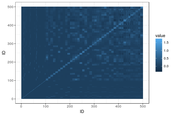
Enter the single-step relationship matrix. The idea is to put in the genomic relationships for the genotyped individuals into the big pedigree-based relationship matrix, and then adjust the rest of the matrix to propagate that extra information we now have from the genotyped individuals to their ungenotyped relatives. Here is the resulting heatmap:

You can find the matrix equations in Legarra, Aguilar & Misztal (2009). The matrix, called H, is broken down into four partitions called H11, H12, H21, and H22. H22 is the part that pertains to the genotyped animals, and it’s equal to the genomic relationship matrix G (after some rescaling). The others are transformations of G and the corresponding parts of the additive relationship matrix, spreading G onto A.

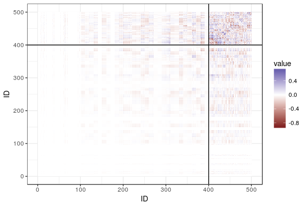
To show what is going on, here is the difference between the additive relationship matrix and the single-step relationship matrix, with lines delineating the genotyped animals and breaking the matrix into the four partitions:

What do we see? In the top right corner, we have a lot of difference, where the genomic relationship matrix has been plugged in. Then, fading as we go from top to bottom and from right to left, we see the influence of the genomic relationship on relatives, diminishing the further we get from the genotyped individuals.

Literature

Legarra, Andres, I. Aguilar, and I. Misztal. ”A relationship matrix including full pedigree and genomic information.” Journal of dairy science 92.9 (2009): 4656-4663.