The developers of the MoBPS breeding programme simulators have published three papers about it over the last years: one about the MoBPS R package (Pook et al. 2020), one about their web server MoBPSweb (Pook et al. 2021), and one that discusses the logic of the specification for breeding programmes they use in the web interface (Simianer et al. 2021). The idea is that this specification can be used to describe breeding programmes in a precise and interoperable manner. The latter — about breeding programme specification — reads as if the authors had a jolly good time thinking about what breeding and breeding programmes are; at least, I had such feelings while reading it. It is accompanied by an editorial by Simianer (2021) talking about what he thinks are the important research directions for animal breeding research. Using simulation to aid breeding programme design is one of them.
Defining and specifying breeding programmes
After defining a breeding programme in a narrow genetic sense as a process achieving genetic change (more about that later), Simianer et al. (2021) go on to define a specification of such a breeding programme — or more precisely, of a model of a breeding programme. They use the word ”definition” for both things, but they really talk about two different things: defining what ”a breeding programme” is and specifying a particular model of a particular breeding programme.
Here, I think it is helpful to think of Guest & Martin’s (2020) distinction, borrowed from psychology, between a specification of a model and an implementation of a model. A specification is a description of a model based in natural language or math. Breeding programme modelling often takes the shape of software packages, where the software implementation is the model and a specification is quite vague. Simianer et al. (2021) can be seen as a step towards a way of writing specifications, on a higher level in Guest & Martin’s hierarchy, of what such a breeding programme model should achieve.
They argue that such a specification (”formal description”) needs to be comprehensive, unambiguous and reproducible. They claim that this can be achieved with two parts: the breeding environment and the breeding structure.
The breeding environment includes:
- founder populations,
- quantitative genetic parameters for traits,
- genetic architectures for traits,
- economic values for traits in breeding goal,
- description of genomic information,
- description of breeding value estimation methods.
Thus, the ”formal” specification depends on a lot of information that is either unknowable in practice (genetic architecture), estimated with error (genetic parameters), hard to describe other than qualitatively (founder population) and dependent on particular software implementations and procedures (breeding value estimation). This illustrates the need to distinguish the map from the territory — to the extent that the specification is exact, it describes a model of a breeding programme, not a real breeding programme.
The other part of their specification is the graph-based model of breeding structure. I think this is their key new idea. The breeding structure, in their specification, consists of nodes that represent groups of elementary objects (I would say ”populations”) and edges that represent transformations that create new populations (such as selection or mating) or are a shorthand for repeating groups of edges and nodes.
The elementary objects could be individuals, but they also give the example of gametes and genes (I presume they mean in the sense of alleles) as possible elementary objects. One could also imagine groups of genetically identical individuals (”genotypes” in a plant breeding sense). Nodes contain a given number of individuals, and can also have a duration.
Edges are directed, and correspond to processes such as ageing, selection, reproduction, splitting or merging populations. They will carry attributes related to the transformation. Edges can have a time associated with them that it takes for the transformation to happen (e.g. for animals to gestate or grow to a particular age). Here is an example from Pook et al. (2021) of a breeding structure graph for dairy cattle:
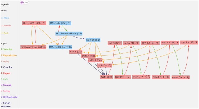
If we ignore the red edges for now, we can follow the flow of reproduction (yellow edges) and selection (green edges): The part on the left is what is going on in the breeding company: cows (BC-Cows) reproduce with selected bulls (BC-SelectedBulls), and their offspring become the next generation of breeding company cows and bulls (BC-NextCows and BC-NextBulls). On the right is the operation of a farm, where semen from the breeding company is used to inseminate cows and heifers (heifer, cow-L1, cow-L2, cow-L3) to produce calfs (calf-h, calf-L1, calf-L2, calf-L3). Each cycle each of these groups, through a selection operation, give rise to the next group (heifers becoming cows, first lactation cows becoming second lactation cows etc).
Breeding loops vs breeding graphs vs breeding forms
Except for the edges that specify breeding operations, there is also a special meta-edge type, the repeat edge, that is used to simplify breeding graphs with repeated operations.
A useful edge class to describe breeding programmes that are composed of several breeding cycles is ”repeat.” It can be used to copy resulting nodes from one breeding cycle into the nodes of origin of the next cycle, assuming that exactly the same breeding activities are to be repeated in each cycle. The “repeat” edge has the attribute “number of repeats” which allows to determine the desired number of cycles.
In the MoBPSweb paper (Pook et al. 2020), they describe how it is implemented in MoBPS: Given a breeding specification in MoBPSweb JSON format, the simulator will generate a directed graph by copying the nodes on the breeding cycle as many times as is specified by the repeat number. In this way, repeat edges are eliminated to make the breeding graph acyclic.
The conversion of the breeding scheme itself is done by first detecting if the breeding scheme has any “Repeat” edges (Simianer et al. 2020), which are used to indicate that a given part of the breeding programme is carried out multiple times (breeding cycles). If that is the case, it will subsequently check which nodes can be generated without the use of any repeat. Next, all repeats that can be executed based on the already available nodes are executed by generating copies of all nodes between the node of origin and the target node of the repeat (including the node of origin and excluding the target node). Nodes generated via repeat are serial-numbered via “_1,” “_2” etc. to indicate the repeat number. This procedure is repeated until all repeat edges are resolved, leading to a breeding programme without any repeats remaining.
There are at least three ways to specify the breeding structures for breeding programme simulations: these breeding graphs, breeding loops (or more generally, specifying breeding in a programming language) and breeding forms (when you get a pre-defined breeding structure and are allowed fill in the numbers).
If I’m going to compare the graph specification to what I’m more familiar with, this is how you would create a breeding structure in AlphaSimR:
library(AlphaSimR)

## Breeding environment

founderpop <- runMacs(nInd = 100,
                      nChr = 20)
simparam <- SimParam$new(founderpop)
simparam$setSexes("yes_sys")
simparam$addTraitA(nQtlPerChr = 100)
simparam$setVarE(h2 = 0.3)

## Breeding structure

n_time_steps <- 10

populations <- vector(mode = "list",
                      length = n_time_steps + 1)

populations[[1]] <- newPop(founderpop,
                           simParam = simparam)

for (gen_ix in 2:(n_time_steps + 1)) {

  ## Breeding cycle happens here

}
In the AlphaSimR script, the action typically happens within the loop. You apply different functions on population objects to make your selection, move individuals between parts of the breeding programme, create offspring etc. That is, in the MoBPS breeding structure, populations are nodes and actions are edges. In AlphaSimR, populations are objects and operations are functions. In order to not have to copy paste your breeding code, you use the control flow structures of R to make a loop (or some functional equivalent). In MoBPS graph structure, in order to not have to create every node and edge manually, you use the Repeat edge.
Breeding graphs with many repeat edges with different times attached to them have the potential to be complicated, and the same is true of breeding loops. I would have to use both of them more to have an opinion about what is more or less intuitive.
Now that we’ve described what they do in the paper, let’s look at some complications.
Formal specifications only apply to idealised breeding programmes
The authors claim that their concept provides a formal breeding programme specification (in their words, ”formal description”) that can be fully understood and implemented by breeders. It seems like the specification fails to live up to this ambition, and it appears doubtful whether any type of specification can. This is because they do not distinguish between specifying a model of a breeding programme and specifying a real implementation of a breeding programme.
First, as mentioned above, the ”breeding environment” as described by them, contains information that can never be specified for any real population, such as the genetic architecture of complex traits.
Second, their breeding structure is described in terms of fixed numbers, which will never be precise due to mortality, conception rates, logistics and practical concerns. They note such fluctuations in population size as a limitation in the Discussion. To some extent, random mortality, reproductive success etc an be modelled by putting random distributions on various parameters. (I am not sure how easy this is to do in the MoBPS framework; it is certainly possible.) However, this adds uncertainty about what these hyperparameter should be and whether they are realistic.
Such complications would just be nit-picking if the authors had not suggested that their specification can be used to communicate breeding programmes between breeders and between breeders and authorities, such as when a breeding programme is seeking approval. They acknowledge that the authorities, for example in the EU, want more detailed information that are beyond the scope of their specification.
And the concept is not very formal in the first place
Despite the claimed formality, every class of object in the breeding structure is left open, with many possible actions and many possible attributes that are never fully defined.
It is somewhat ambiguous what is to be the ”formal” specification — it cannot be the description in the paper as it is not very formal or complete; it shouldn’t be the implementation in MoBPS and MoBPSweb, as the concept is claimed to be universal; maybe it is the JSON specification of the breeding structure and background as described in the MoBPSweb paper (Pook et al. 2020). The latter seems the best candidate for a well-defined formal way to specify breeding programme models, but then again, the JSON format appears not to have a published specification, and appears to contain implementation-specific details relating to MoBPS.
This also matters to the suggested use of the specification to communicate real breeding programme designs. What, precisely, is it that will be communicated? Are breed societies and authorities expected to communicate with breeding graphs, JSON files, or with verbal descriptions using their terms (e.g. ”breeding environment”, ”breeding structure”, their node names and parameters for breeding activities)?
There is almost never a need for a definition
As I mentioned before, the paper starts by asking what a breeding programme is. They refer to different descriptions of breeding programme design from textbooks, and a legal definition from EU regulation 2016/1012; article 2, paragraph 26, which goes:
‘breeding programme’ means a set of systematic actions, including recording, selection, breeding and exchange of breeding animals and their germinal products, designed and implemented to preserve or enhance desired phenotypic and/or genotypic characteristics in the target breeding population.
There seems to be some agreement that a breeding programme, in addition to being the management of reproduction of a domestic animal population, also is systematic and goal-directed activity. Despite these descriptions of breeding programmes and their shared similarity, the authors argue that there is no clear formal definition of what a breeding programme is, and that this would be useful to delineate and specify breeding programmes.
They define a breeding programme as an organised process that aims to change the genetic composition in a desired direction, from one group of individuals to a group of individuals at a later time. The breeding programme comprises those individuals and activities that contribute to this process. For example, crossbred individuals in a multiplier part of a terminal crossbreeding programme would be included to the extent that they contribute information to the breeding of nucleus animals.
We define a breeding programme as a structured, man-driven process in time that starts with a group of individuals X at time  and leads to a group of individuals Y at time
  . The objective of a breeding programme is to transform the genetic characteristics of group X to group Y in a desired direction, and a breeding programme is characterized by the fact that the implemented actions aim at achieving this transformation.
They actually do not elaborate on what it means that a genetic change has direction, but since they want the definition to apply both to farm animal and conservation breeding programmes, the genetic goals could be formulated both in terms of changes in genetic values for traits and in terms of genetic relationships.
Under many circumstances, this is a reasonable proxy also for an economic target: The breeding structures and interventions considered in theoretical breeding programme designs can often be evaluated in terms of their effect on the response to selection, and if the response improves, so will the economic benefit. However, this definition seems a little unnecessary and narrow. If you wanted to, say, add a terminal crossbreeding step to the simulation and evaluate the performance in terms of the total profitability of the crossbreeding programme (that is, something that is outside of the breeding programme in the sense of the above definition), nothing is stopping you, and the idea is not in principle outside of the scope of animal breeding.
Finally, an interesting remark about efficiency
When discussing the possibility of using their concept to communicate breeding programmes to authorities when seeking approval the authors argue that authorities should not take efficiency of the breeding programme into account when they evaluate breeding programmes for approval. They state this point forcefully without explaining their reasoning:
It should be noted, though, that an evaluation of the efficiency of breeding programme is not, and should never be, a precondition for the approval of a breeding programme by the authorities.
This raises the question: why not? There might be both environmental, economical and animal ethical reasons to consider not approving breeding programmes that can be shown to make inefficient use of resources. Maybe such evaluation would be impractical — breeding programme analysis and simulation might have to be put on a firmer scientific grounding and be made more reproducible and transparent before we trust it to make such decisions — but efficiency does seem like an appropriate thing to want in a breeding scheme, also from the perspective of society and the authorities.
I am not advocating any particular new regulation for breeding programmes here, but I wonder where the ”should never” came from. This reads like a comment added to appease a reviewer — the passage is missing from the preprint version.
Literature
Pook, T., Schlather, M., & Simianer, H. (2020a). MoBPS-modular breeding program simulator. G3: Genes, Genomes, Genetics, 10(6), 1915-1918. https://academic.oup.com/g3journal/article/10/6/1915/6026363
Pook, T., Büttgen, L., Ganesan, A., Ha, N. T., & Simianer, H. (2021). MoBPSweb: A web-based framework to simulate and compare breeding programs. G3, 11(2), jkab023. https://academic.oup.com/g3journal/article/11/2/jkab023/6128572
Simianer, H., Büttgen, L., Ganesan, A., Ha, N. T., & Pook, T. (2021). A unifying concept of animal breeding programmes. Journal of Animal Breeding and Genetics, 138 (2), 137-150. https://onlinelibrary.wiley.com/doi/full/10.1111/jbg.12534
Simianer, H. (2021), Harvest Moon: Some personal thoughts on past and future directions in animal breeding research. J Anim Breed Genet, 138: 135-136. https://doi.org/10.1111/jbg.12538
Guest, O., & Martin, A. E. (2020). How computational modeling can force theory building in psychological science. Perspectives on Psychological Science, 1745691620970585. https://journals.sagepub.com/doi/full/10.1177/1745691620970585


