PCA is a very common method for exploration and reduction of high-dimensional data. It works by making linear combinations of the variables that are orthogonal, and is thus a way to change basis to better see patterns in data. You either do spectral decomposition of the correlation matrix or singular value decomposition of the data matrix and get linear combinations that are called principal components, where the weights of each original variable in the principal component are called loadings and the transformed data are called scores. Spurred by this question, I thought I’d share my favourite PCA plots. Of course, this example uses R and ggplot2, but you could use anything you like.
First, let us generate some nonsense data — 50 samples and 70 variables in groups of ten. Variables in the same group are related, and there is relationship between values of the variables and sample group numbers. I didn’t worry too much about the features of the data, except I wanted some patterns and quite a bit of noise. The first principal component explains approximately 20% of the variance.
sample.groups <- c(rep(1, 10), rep(2, 10), rep(3, 10),
  rep(4, 10), rep(5, 10))
variable.groups <- c(rep(1, 10), rep(2, 10), rep(3, 10),
  rep(4, 10), rep(5, 10), rep(6, 10),
  rep(7, 10))

data <- matrix(nrow=length(sample.groups), ncol=70)
base.data <- matrix(nrow=length(sample.groups), ncol=7)

for (j in 1:ncol(base.data)) {
  mu <- rnorm(1, 0, 4)
  sigma <- runif(1, 5, 10)
  base.data[,j] <- sample.groups*mu +
  rnorm(length(sample.groups), 0, sigma)
}

for (j in 1:ncol(data)) {
  mu <- runif(1, 0, 4)
  data[,j] <- base.data[,variable.groups[j]] +
  rnorm(length(sample.groups), mu, 10)
}
Here is the typical correlation heatmap of the variables:
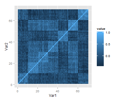
heatmap <- qplot(x=Var1, y=Var2, data=melt(cor(data)), geom="tile",
fill=value)
Maybe what we want to know is what variables go together, and if we can use a few of the principal components to capture some aspect of the data. So we want to know which variables have high loading in which principal components. I think that small multiples of barplots (or dotplots) of the first few principal components does this pretty well:
library(reshape2)
library(ggplot2)

pca <- prcomp(data, scale=T)
melted <- cbind(variable.group, melt(pca$rotation[,1:9]))

barplot <- ggplot(data=melted) +
  geom_bar(aes(x=Var1, y=value, fill=variable.group), stat="identity") +
  facet_wrap(~Var2)

As usual, I haven’t put that much effort into the look. If you were to publish this plot, you’d probably want to use something other than ggplot2 defaults, and give your axes sensible names. In cases where we don’t have a priori variable groupings we can just omit the fill colour. Maybe sorting the bars by loading could be useful to quickly identify the most influential variables.
In other applications we’re more interested in graphically looking for similarities between samples, and then we have more use for the scores. For instance, in genetics a scatterplot of the first principal components is typically used to show for patterns of genetic similarity between individuals drawn from different populations. This is a component of the so-called biplot.
scores <- data.frame(sample.groups, pca$x[,1:3])
pc1.2 <- qplot(x=PC1, y=PC2, data=scores, colour=factor(sample.groups)) +
  theme(legend.position="none")
pc1.3 <- qplot(x=PC1, y=PC3, data=scores, colour=factor(sample.groups)) +
  theme(legend.position="none")
pc2.3 <- qplot(x=PC2, y=PC3, data=scores, colour=factor(sample.groups)) +
  theme(legend.position="none")

In this case, small multiples are not as easily made with facets, but I used the multiplot function by Winston Chang.

Hi Martin,
great post. I recently did a similar post on using the SVD for identifying key variable, http://gforge.se/2013/04/using-the-svd-to-find-the-needle-in-the-haystack/ I used lattice graphics and had a slightly different approach, but basically the same idea.
/Max
Cool! It’s pretty funny to me that we did almost the same thing with almost completely different functions. I really want to learn a little lattice, so I’ll have a look at your code for pointers.
Cheers,
martin
Pingback: Plotting principal component analysis with ggplot #rstats | Strenge Jacke!
You probably want to add
+ coord_fixed()to the plots of the PCA scores in the last example. The axes should be scaled equally in such a plot.Thanks! Yes, that’s probably a good thing to do, though it changes these plots very little.
Cheers,
martin